Meta For Media
Facebook for Media
Timeline
2021 - 2022
Role
Art Director / Experience Design
Overview
With a mission to revitalize Meta’s For Media site, the objective was to create an engaging, modern platform that resonates with media professionals. The challenge was to elevate the brand’s perception, emphasize Meta’s role in media innovation, and establish an intuitive, visually compelling experience.
Outcome
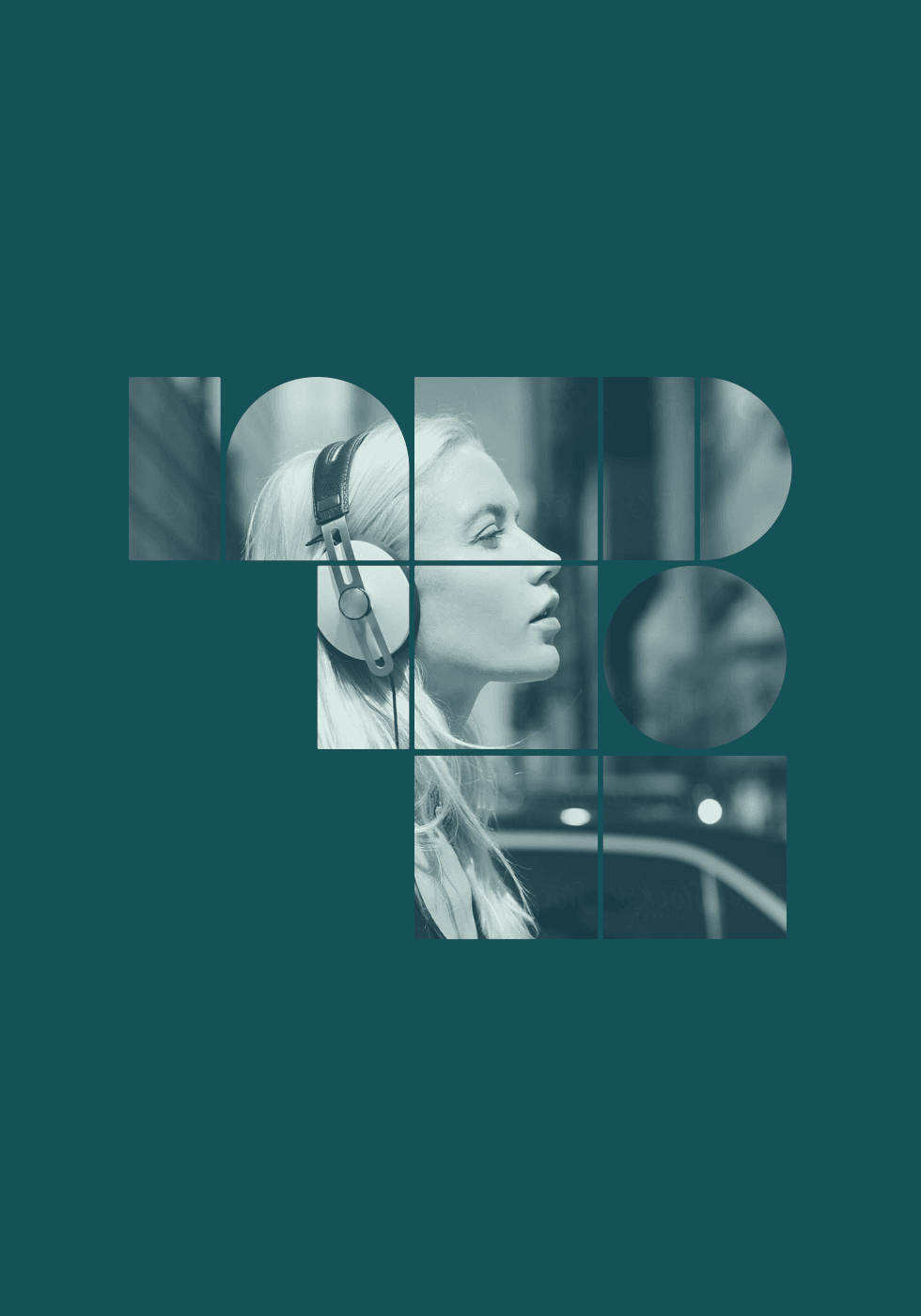
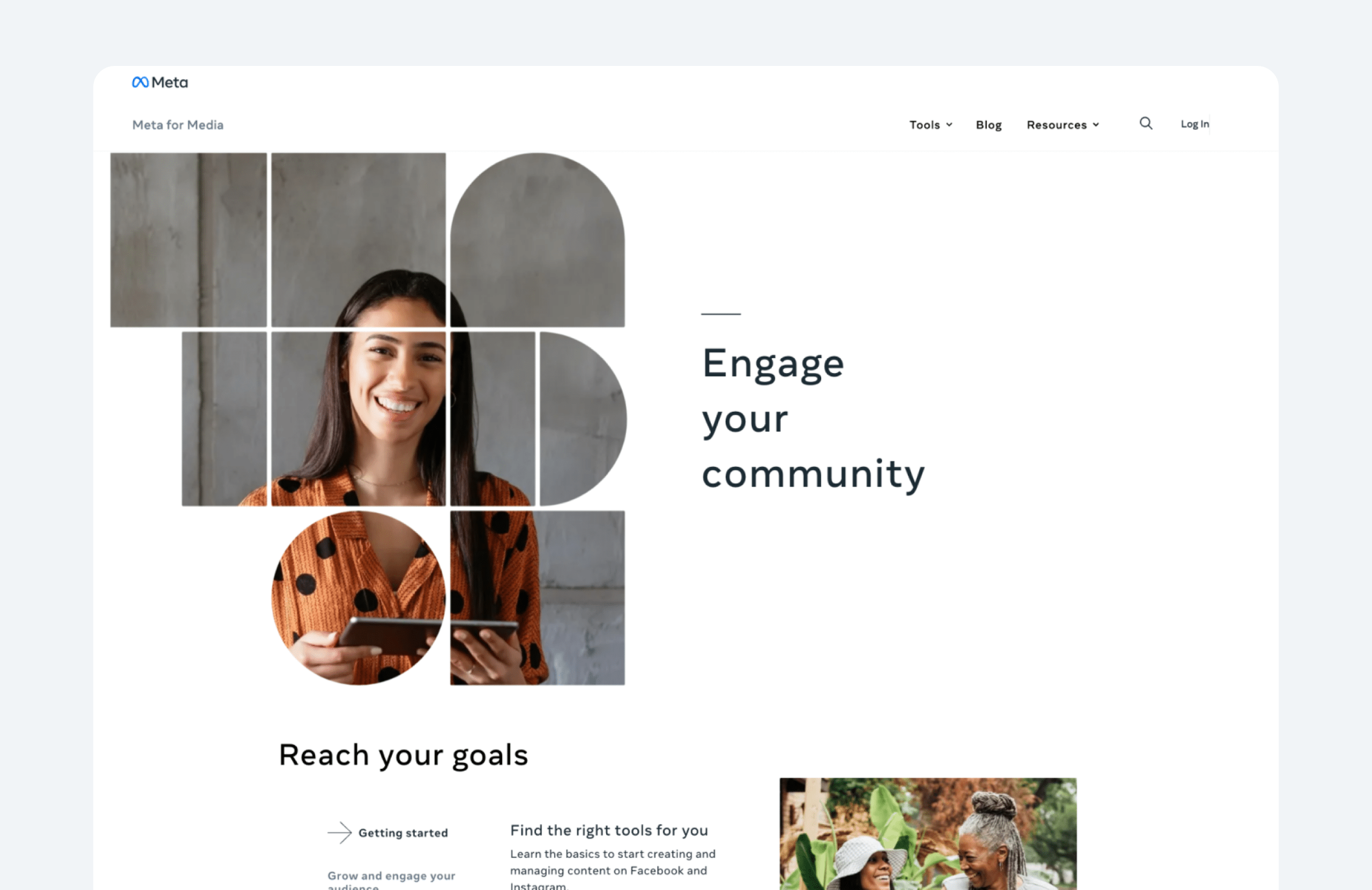
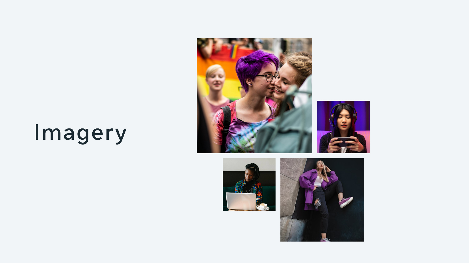
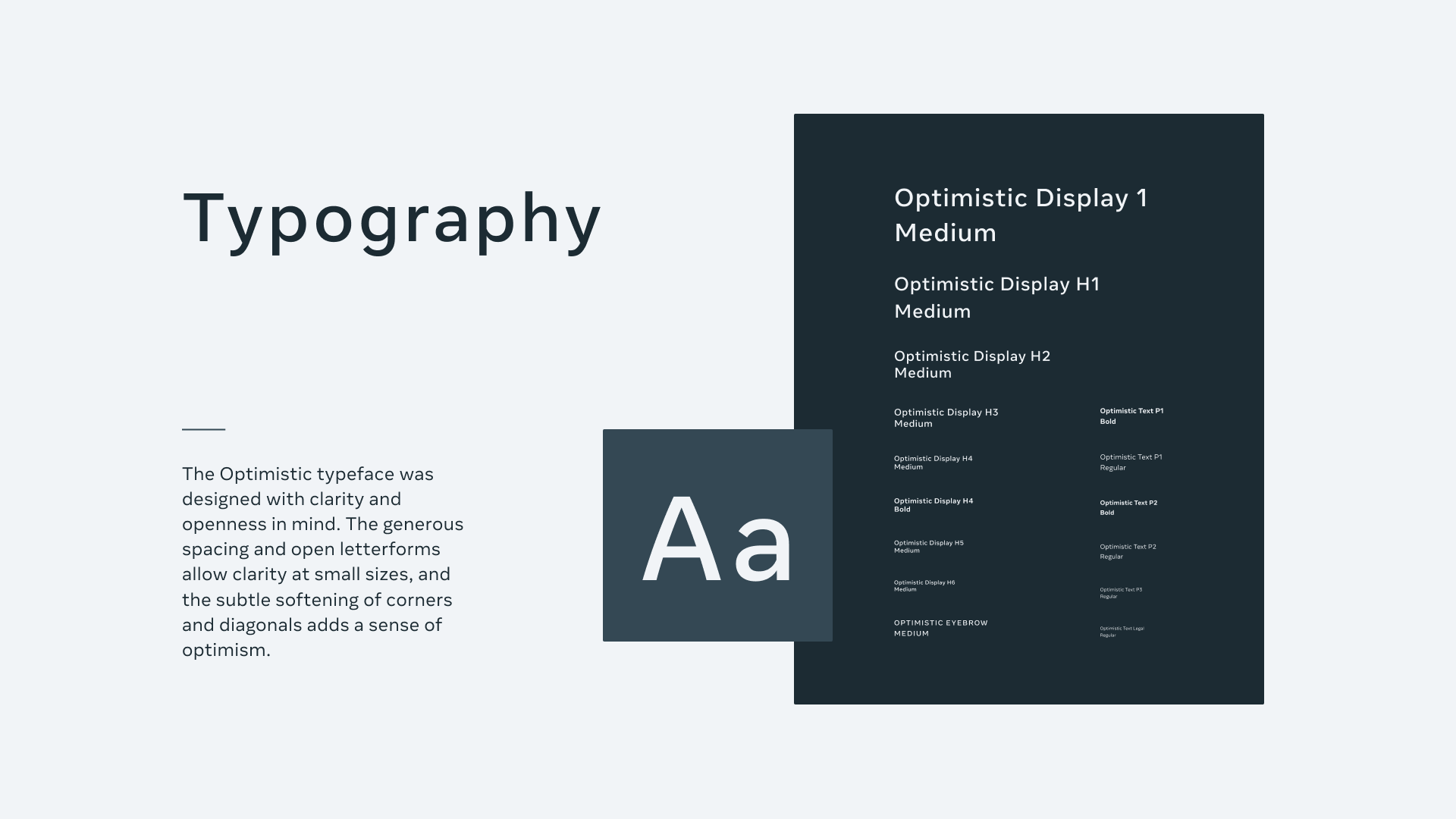
The overhaul featured graphics with bold, typographic elements that conveyed Meta’s confidence and media expertise. Visuals were kept clean and minimal, leveraging whitespace to create an accessible, professional experience for media professionals.
High-level flows, mapping user journeys for accessing key sections, like Media Tools, Insights, and News. The flows prioritized reducing the clicks needed to reach essential resources and guiding users to related content through contextual recommendations.
Post-launch analytics showed a 35% increase in session duration and 20% higher engagement with insights and tools sections.
Results
000
Increase in session duration
000
Higher engagement with insights and tools sections
Research
User Perception
Media professionals viewed the previous site as outdated and lacking brand relevance, impacting Meta’s positioning in media innovation.
User Needs
Users valued quick access to the latest resources, trends, and Meta’s tools designed for media insights.
Competitor Analysis
Competitor sites leaned towards minimalism and functional layouts, often overlooking memorable graphic elements, which presented an opportunity to set Meta apart. Meta could stand out in this area by incorporating memorable visuals and a stronger brand presence.
Insights
Testing with media professionals highlighted the need for more accessible navigation and clear calls to action within each section. Based on this, I refined the navigation bar, added prominent “Quick Links,” and improved content discoverability by refining section headers and visual cues.
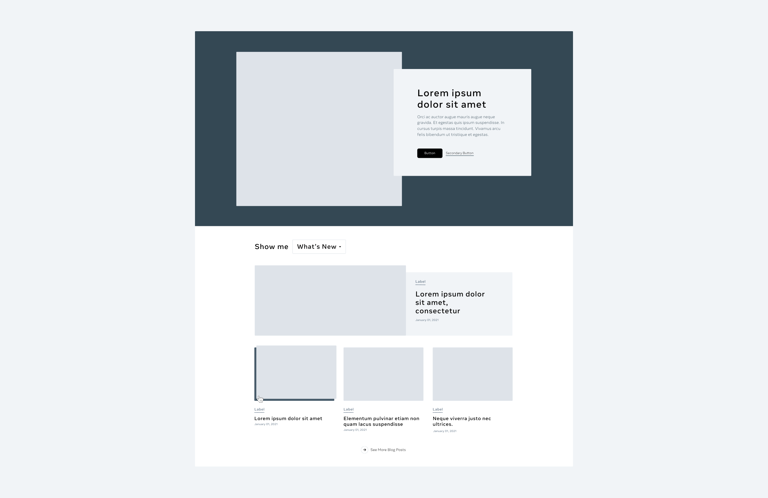
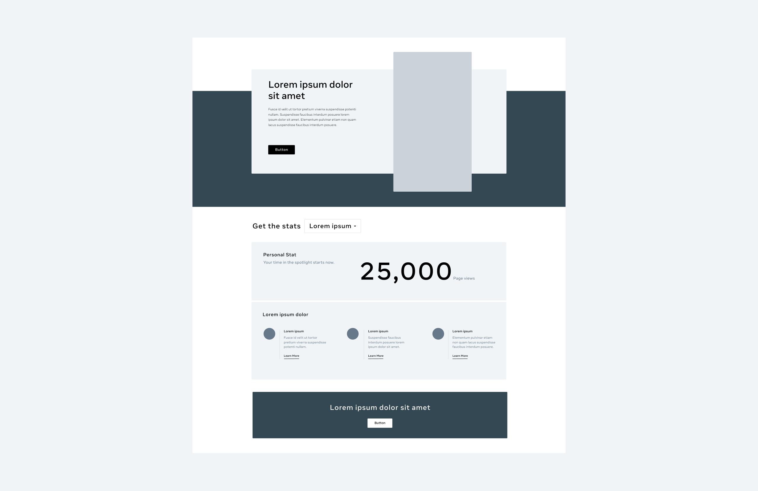
Modular System Design
Impact
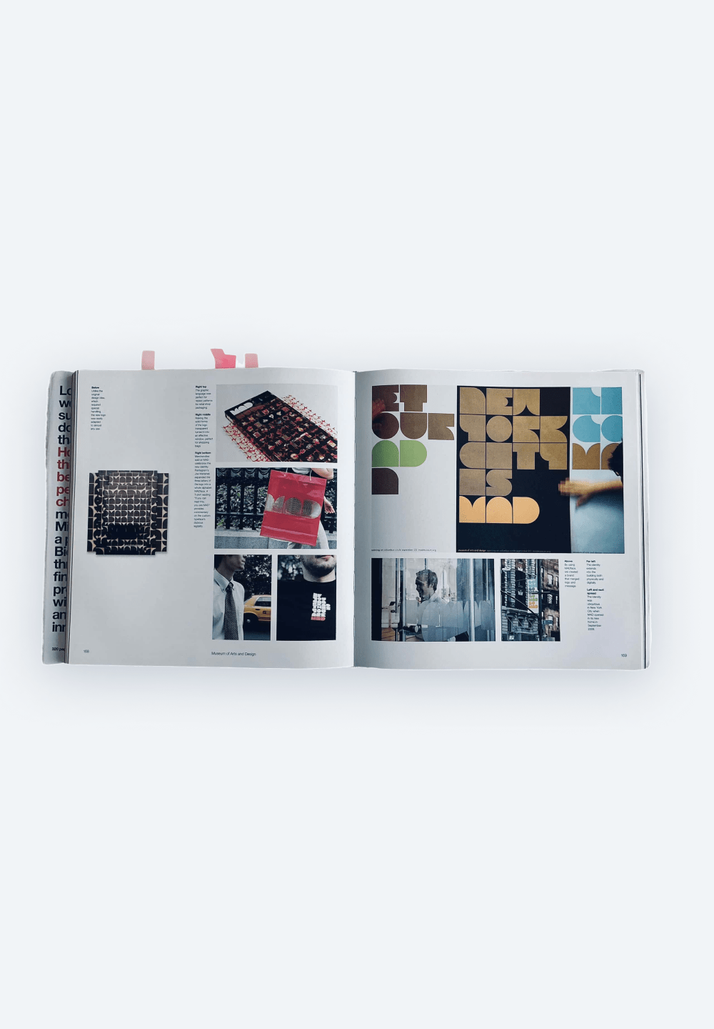
Early concepts explored dynamic hero graphics and bold typography to echo the “big ideas” that Meta embodies for media professionals. Inspired by Michael Bierut’s design principles, we emphasized simplicity paired with a powerful color scheme, creating a balance of corporate sophistication and creative expression.
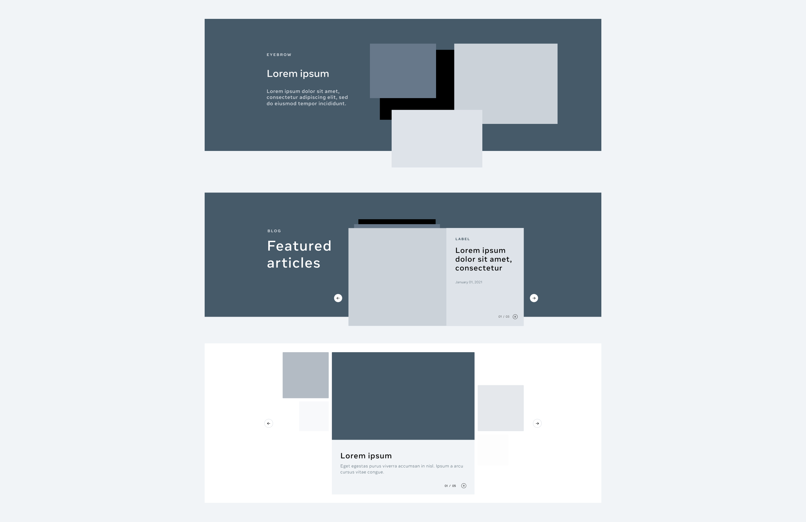
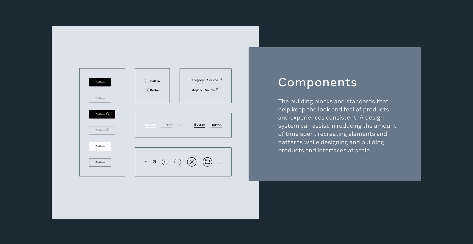
One key advantage of modules in product design is the customizable experience they offer users. By breaking down the interface into independent modules, designers can better personalize the experience according to KPIs and business needs on complex platforms
