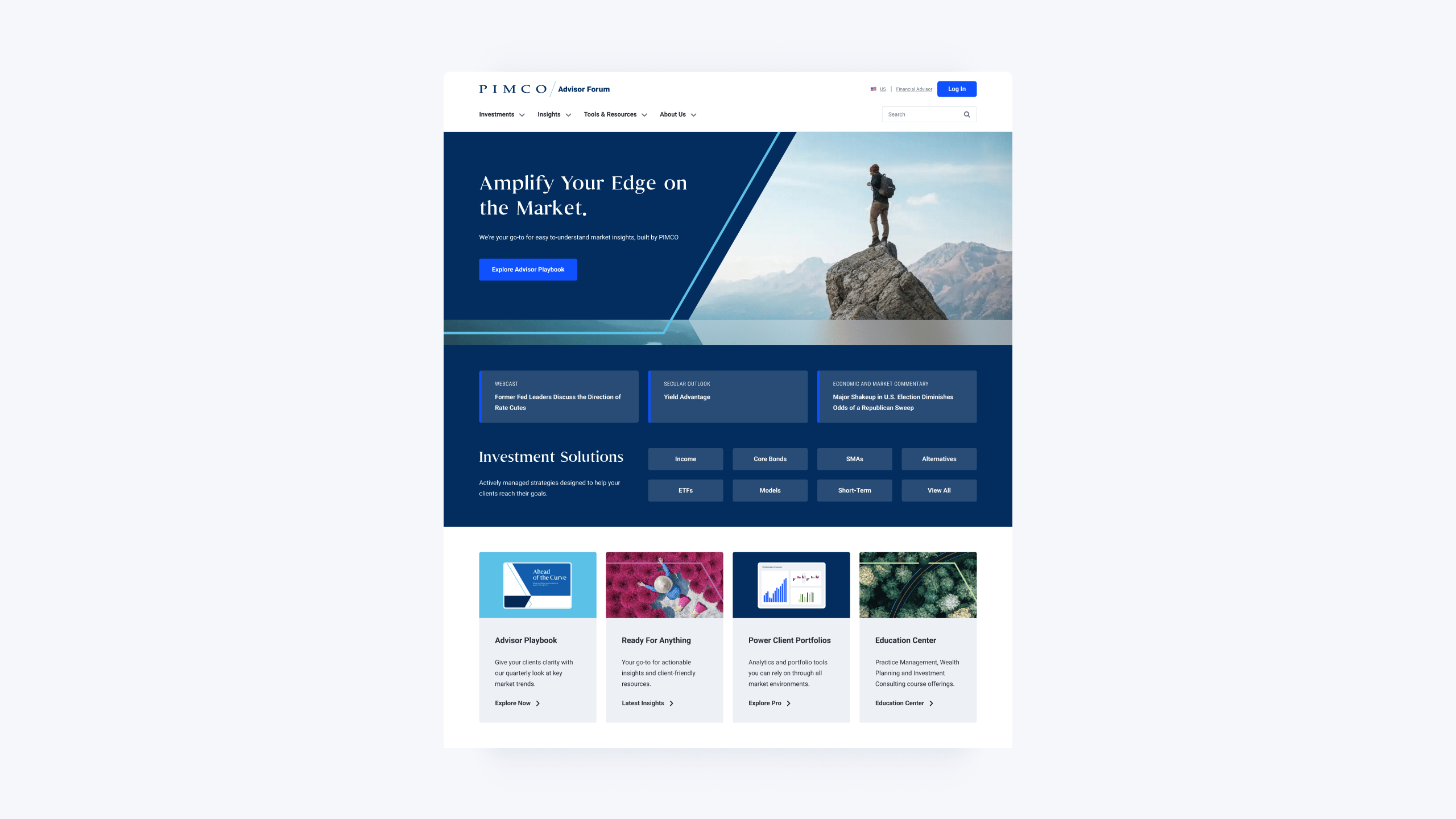
Crafting PIMCO’s Renaissance
Pacific Investment Management Co's Global Digital
Timeframe
2022 - 2025
Role
Lead Product Designer
Overview
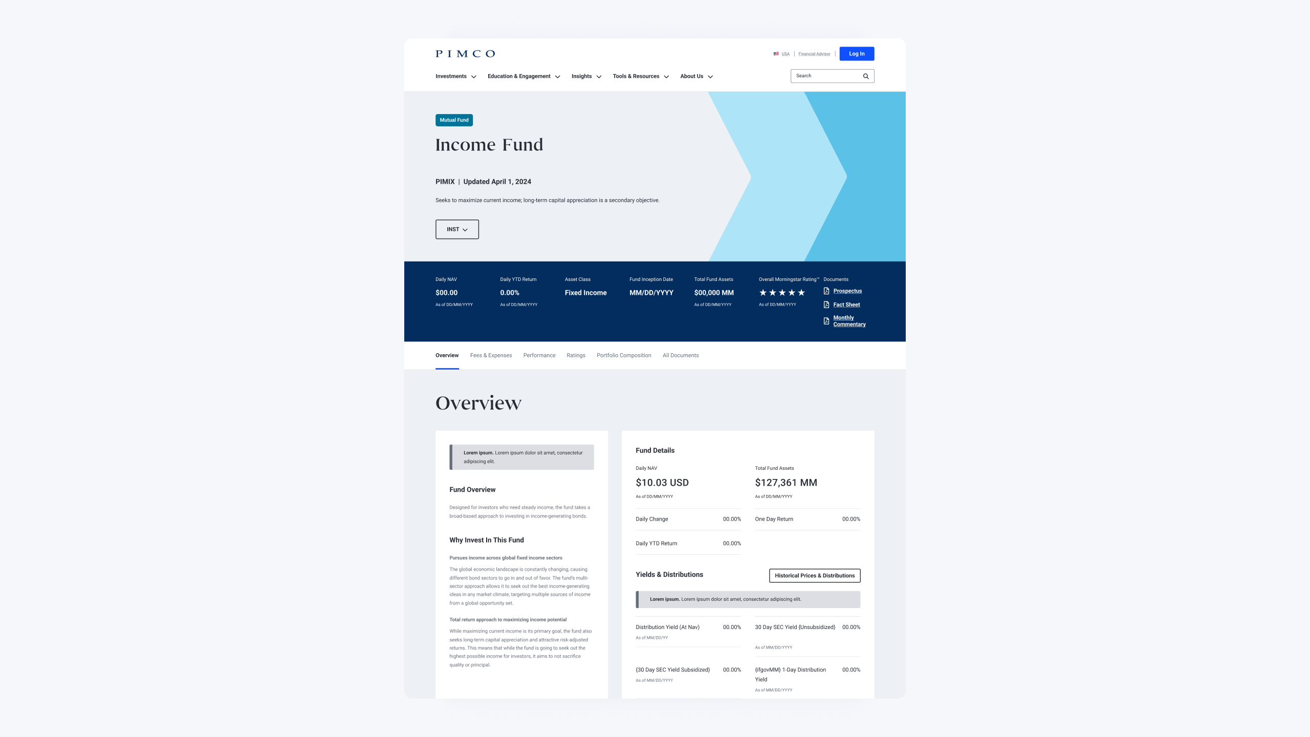
PIMCO (Pacific Investment Management Company) is a leading global investment management firm renowned for its expertise in active fixed-income management and other asset classes.
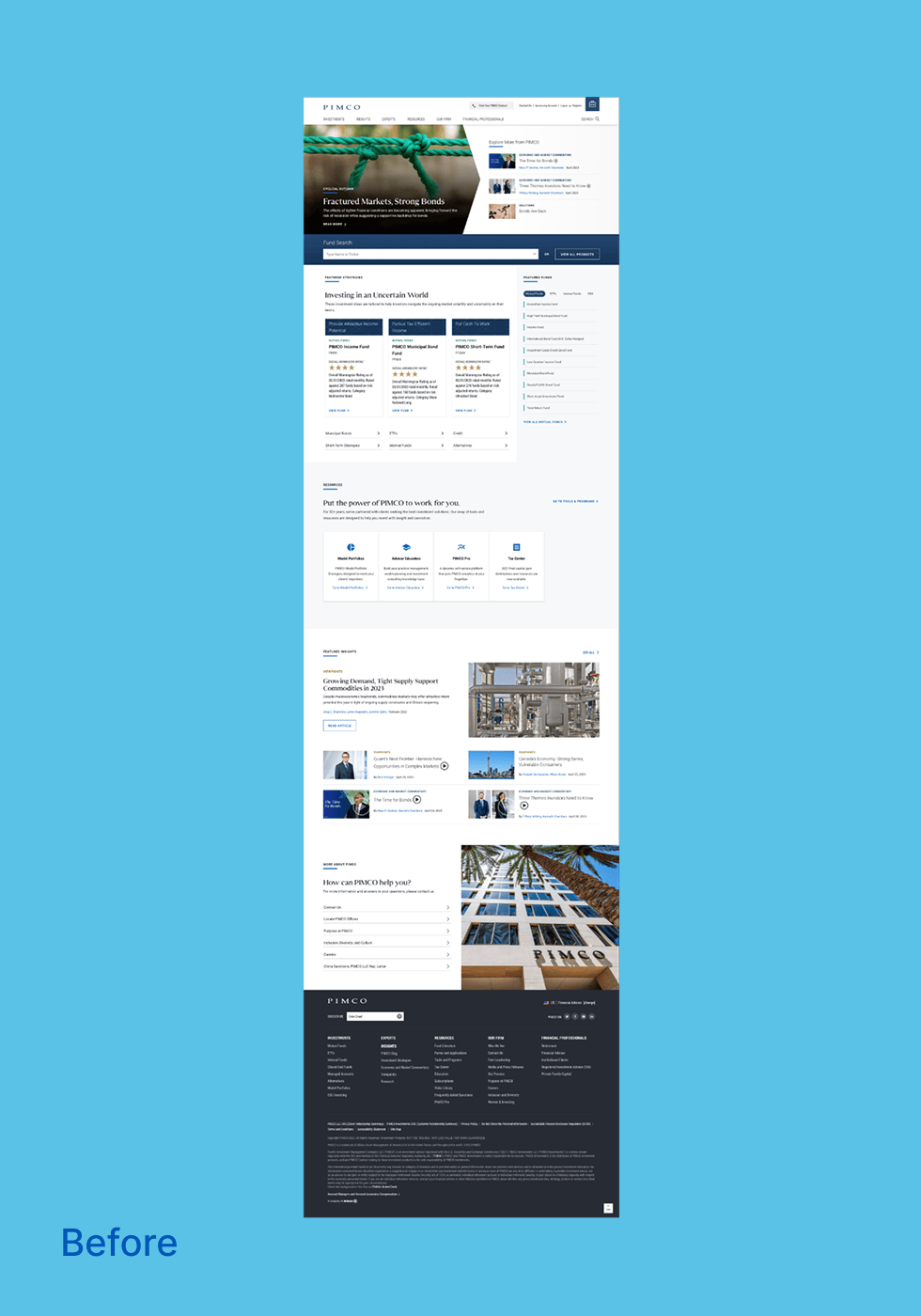
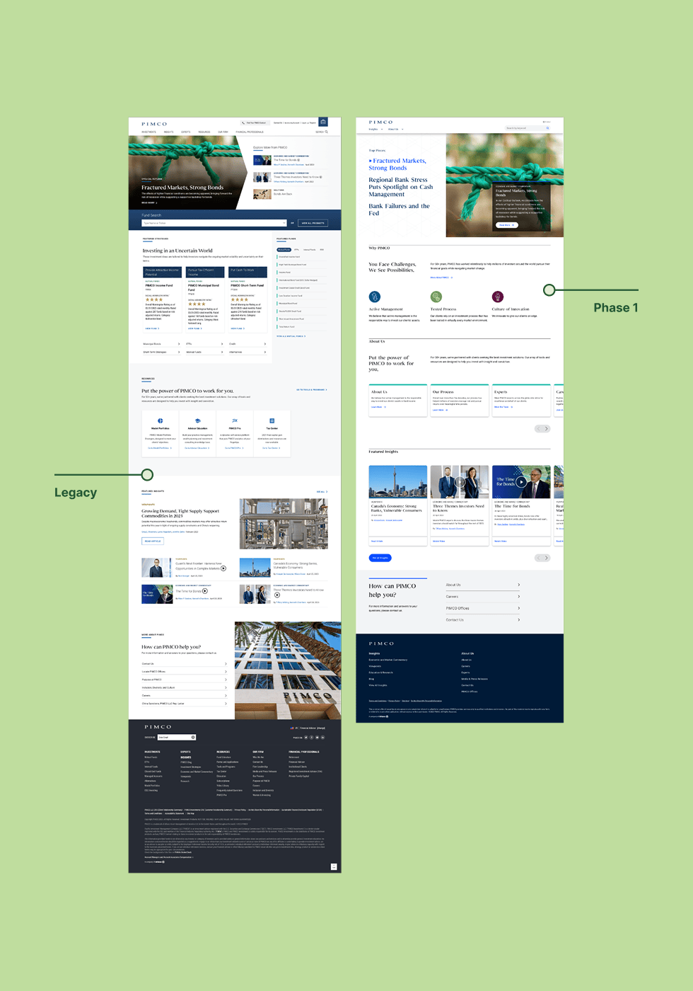
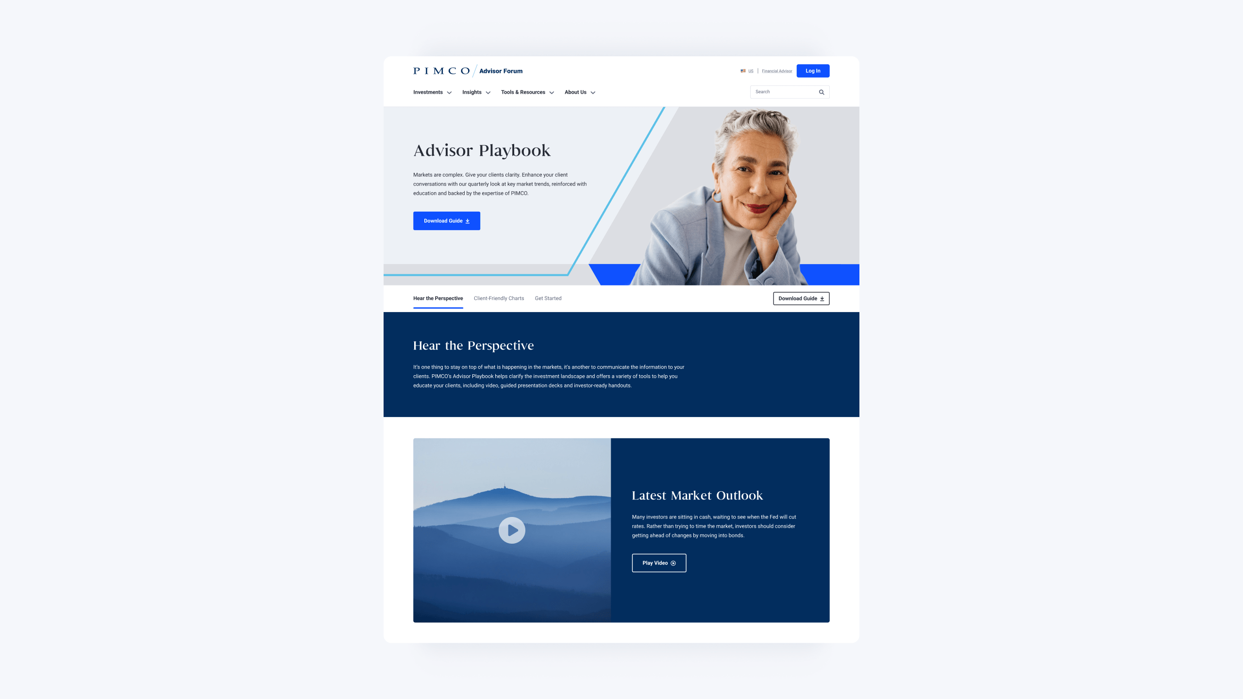
With the sunset of the legacy “Classic” experience, the challenge was to create a new, innovative, and creative solution for investment management that meets the evolving needs of the global market.
This modern presence would improve user experience, enhance brand perception, and simplify navigation for advisors, institutional investors, and retail investors.
0.00
Unique regional experiences catering to financial advisors, institutional, and retail investors across the globe
0.00
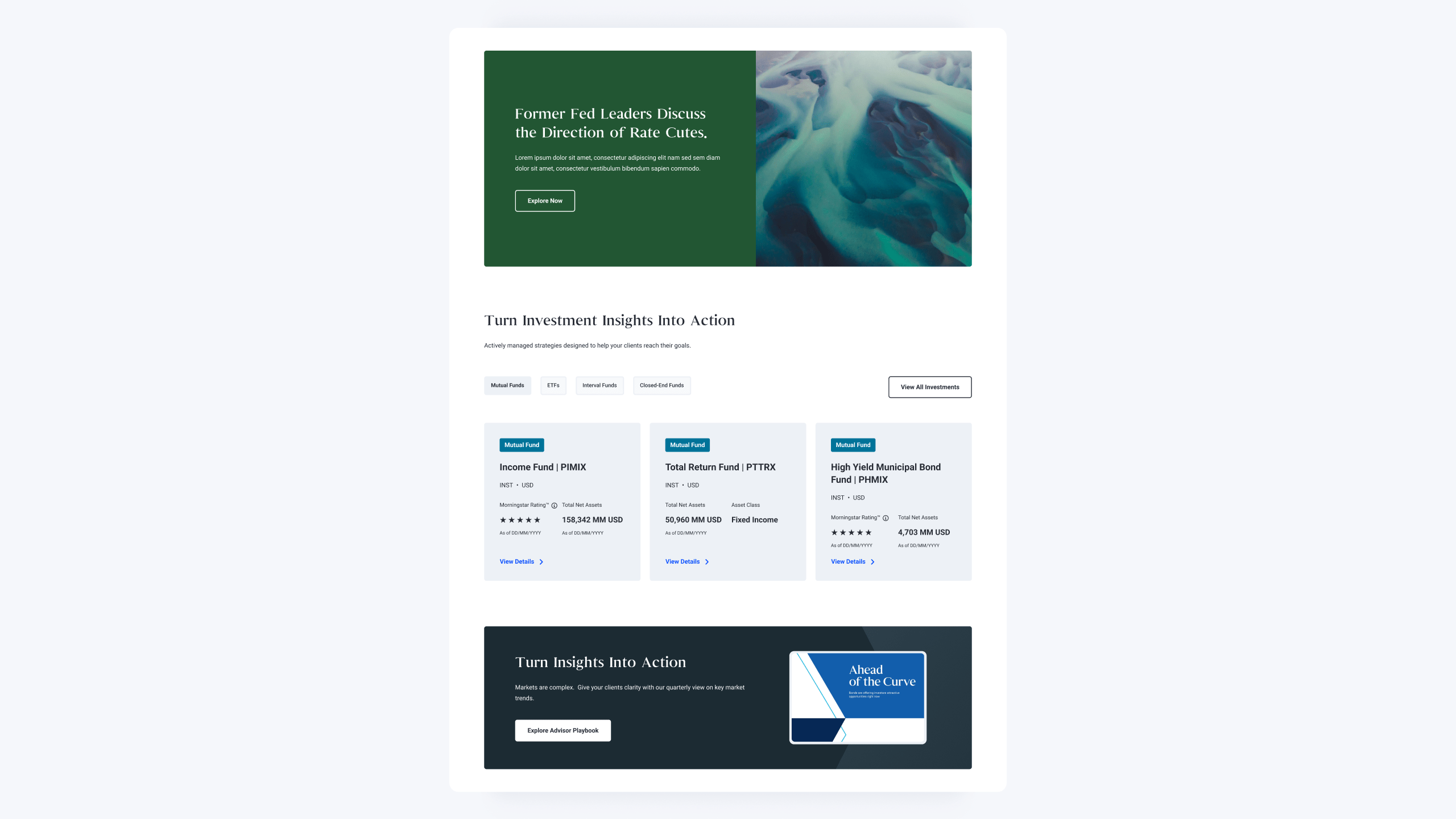
Products ranging from mutual funds, ETFs, interval funds, closed-end funds, separate accounts, alternative investments, and ESG focused strategies
0.00
AUM of data is updated regularly on the UI. What used to be slow to load is much more faster.
Global regions with unique designs, including language and data.
The world is yours. For real, it’s interactive, allowing you to zoom and rotate.
Role
As the Lead Product Designer for this project, I oversaw the entire design process, which included research, facilitating discovery workshops with leadership, validating designs, and testing prototypes. I collaborated closely with the engineering team to ensure that the interaction and system scalability aligned with the guidelines I had established.
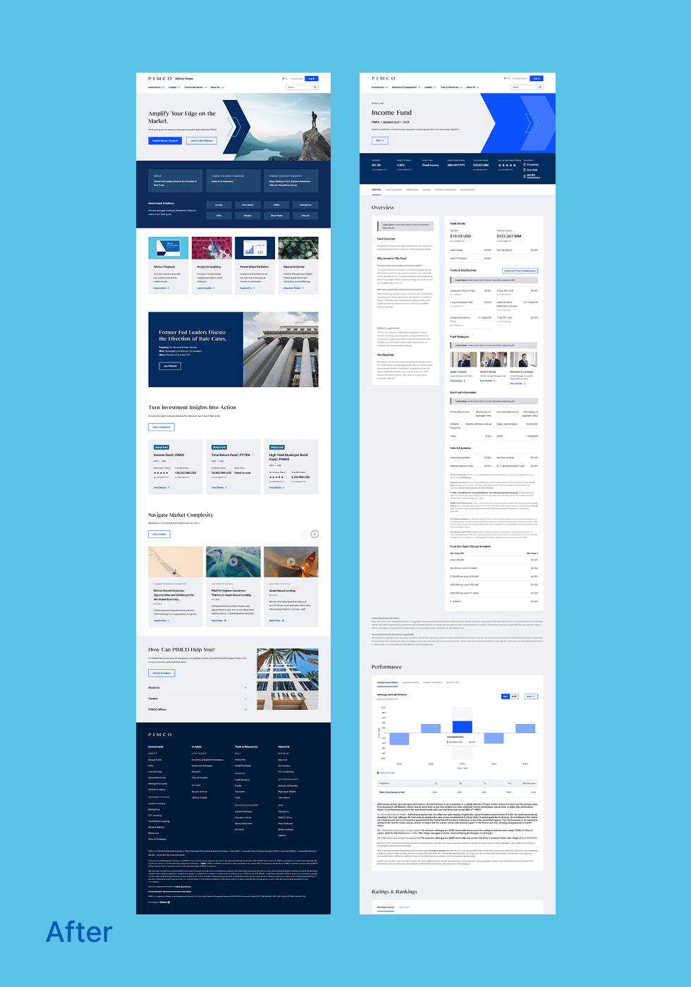
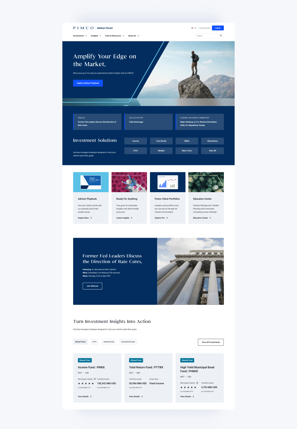
The PIMCO investor platform was in need of a refresh to meet the evolving demands of advisors and investors. I led the redesign effort to transform this digital experience, focusing on usability, transparency, and trust. This project directly impacted PIMCO’s digital reputation and client engagement.
Challenges & Constraints
- Complex regulations
- Legacy systems
- Tight launch window
- Complex navigation
- Information overload
- Inconsistent design elements
- A combination of multiple products into a seamless architecture
Business & Design Goals
- Deliver scalable and intuitive solutions
- Support compliance and data security
- Increase adoption
- Emphasis on accessibility and personalized insights
- Modernizing a global asset manager’s core platform
- Intuitive Navigation
- Personalized client experience
- Unified regional design system
- Enhanced content accessibility
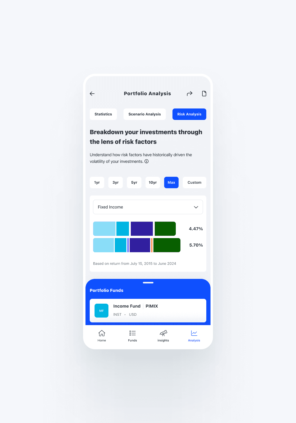
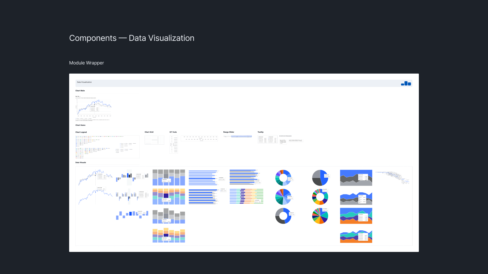
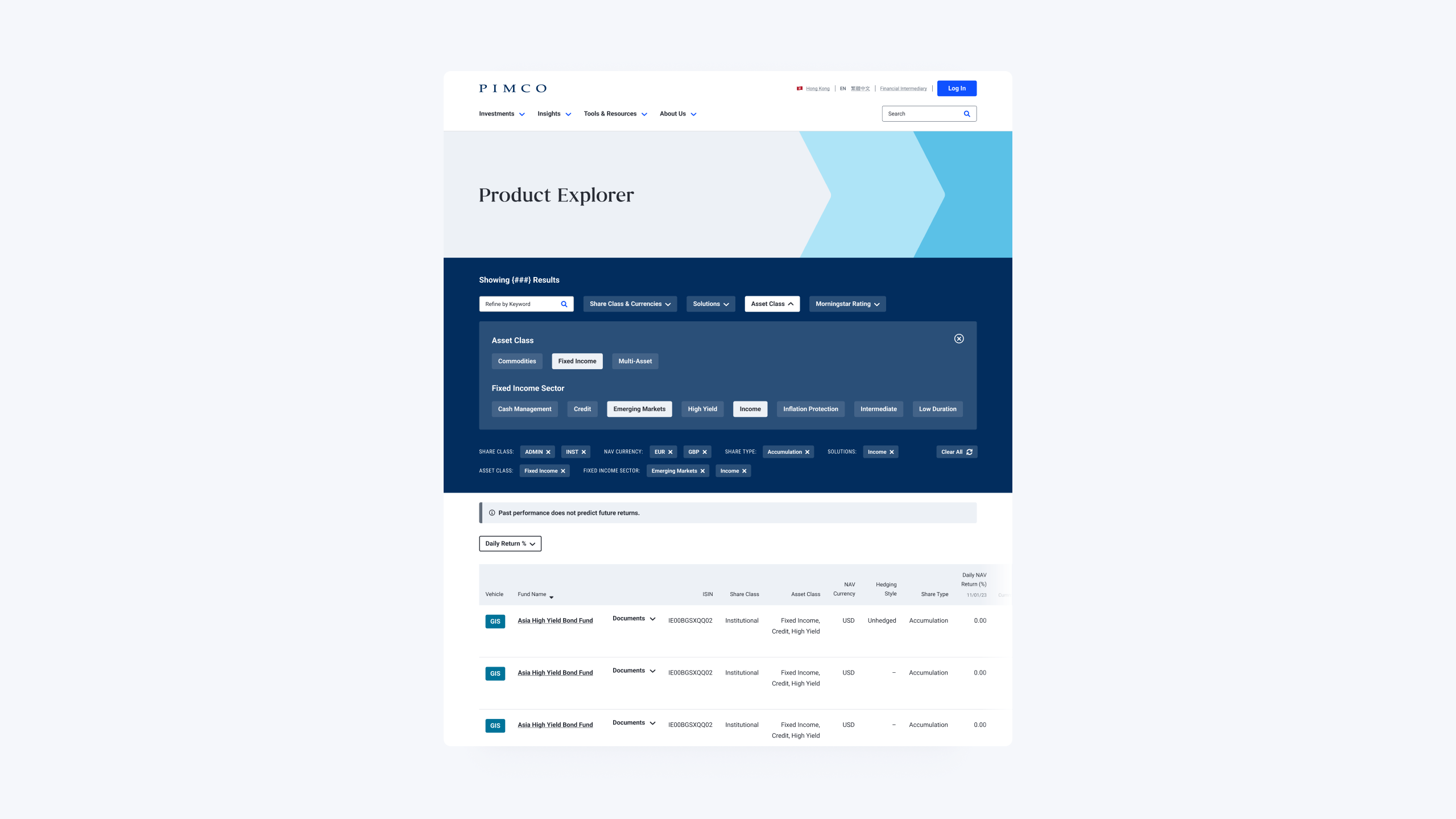
- Data visualization with performance and analysis tools
Impact
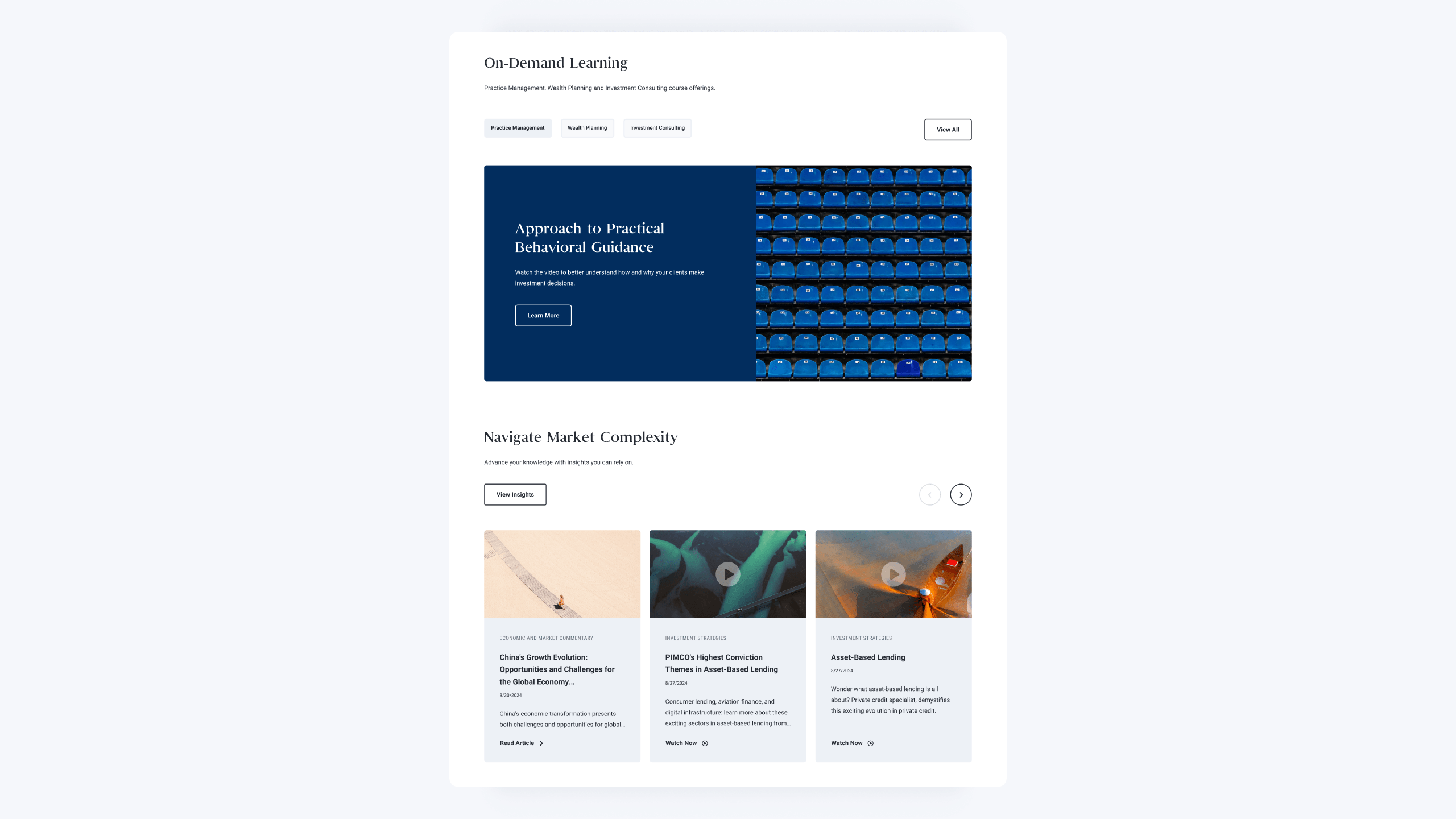
A clean, variable design system that is user-focused and has a clean structure to navigate. More access to features like product performance and investment strategies. With integrated high-impact visuals that support PIMCO’s chevron brand identity but also address modern sensibilities.
Implemented Solutions
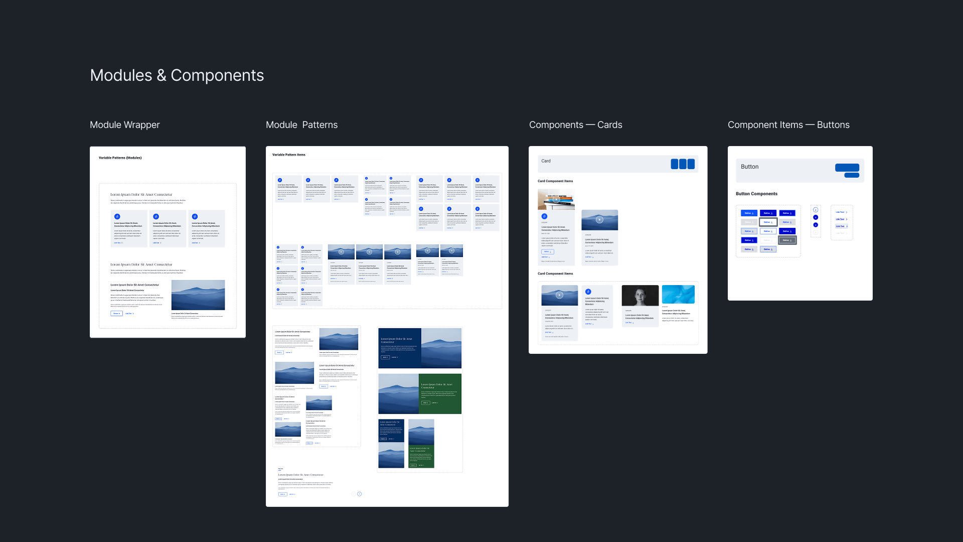
- Storybook components
- Modular variable-based design system
- Interactive data visualization
- Enhanced usability and user experience
Outcomes
- Improved architecture and navigation
- Updated data visualization for performance and analysis tools
- Improved performance, security, and scalability result in a seamless user experience
- Operational efficiency
- Regional brand consistency
Results
0.00
Increased average time-on-site
0.00
Growth in daily active users
0.00
Improved user satisfaction scores
0.00
Increase in development efficiency
Process
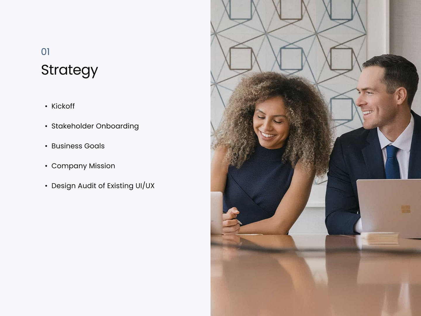
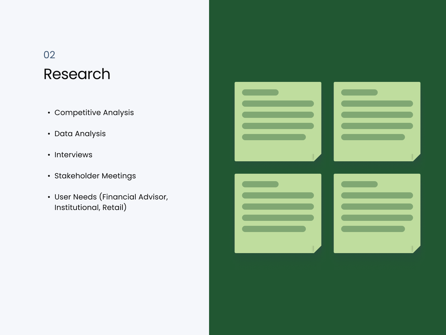
Discovery & Research
We worked with McKinsey consultants and cross-functional teams to identify inconsistencies in our brand, map areas of pain, prioritize focus for an efficient design system, and develop a shared vision around elements in products by type of user.
- User interviews and journey maps
- Workshops with product, compliance, and legal
- Identification of core user needs
- Keep in mind who the user is and where they are within the flow.
- Institutional investors and financial advisors needed instant access to portfolio management capabilities, market insights, and performance data.
- The brand needed to be perceived as new, but not at the expense of trust and credibility in the investment community.
Design Audit

Competitive Analysis – Feature Comparison Matrix

Collaboration
Collaboration was critical: working weekly with product managers, engineers, legal, and compliance teams, I drove consensus on trade-offs using user data and usability metrics to advocate for experience improvements.
Early user testing revealed that users intuited the new navigation but requested more pronounced visual cues for key data points.
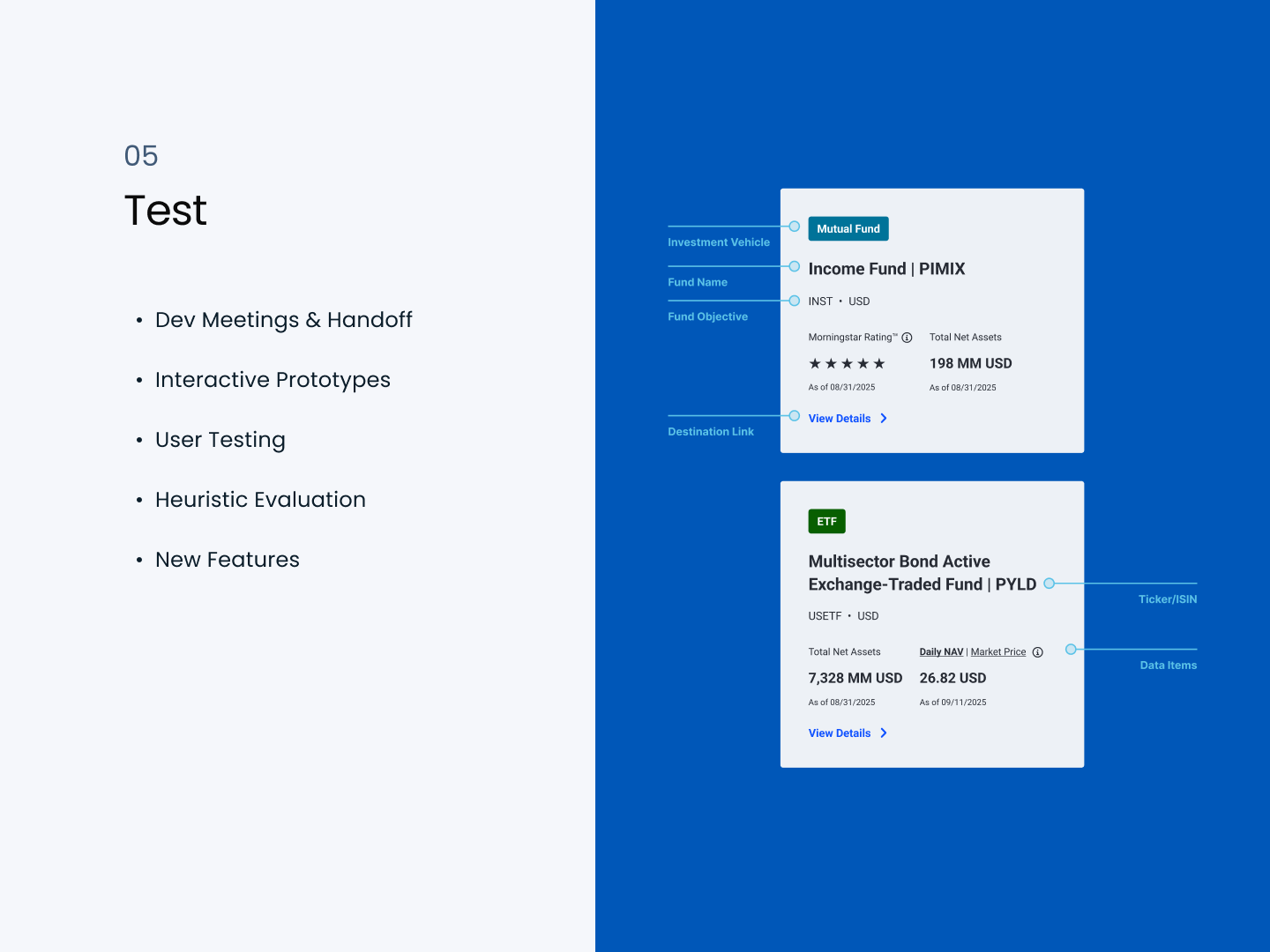
With stakeholders wanting the combined experience of web and pro integrated to include Highcharts data visualizations and interactive tools for real-time monitoring of performance and analysis. This would also improve registration numbers and logins.
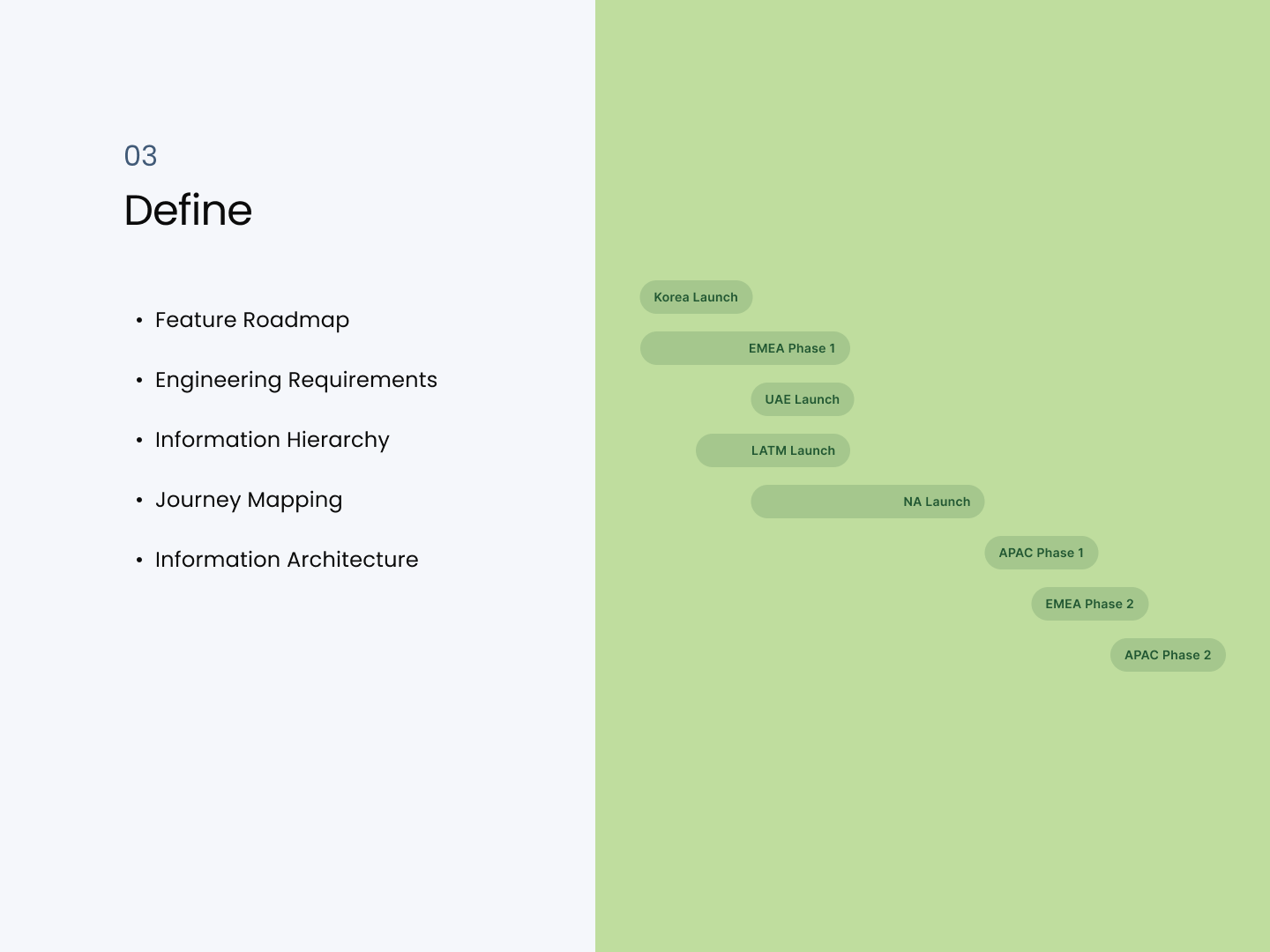
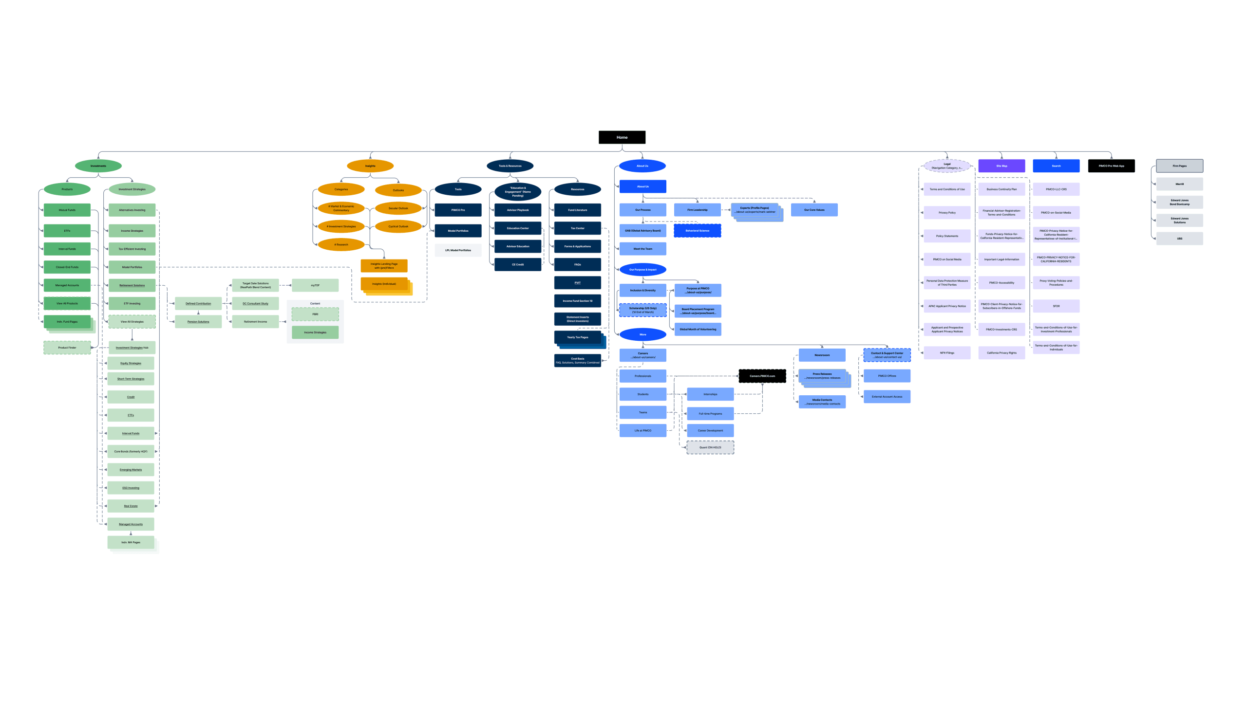
Architecture
It was challenging to design a scalable system for efficient financial operations and decision-making for a list of regions across the globe. At the time, the main focus was on strategies and products. We crafted solutions that enriched data, simplified journey flow, and ensured compliance while assisting the strategic objectives of the firm.
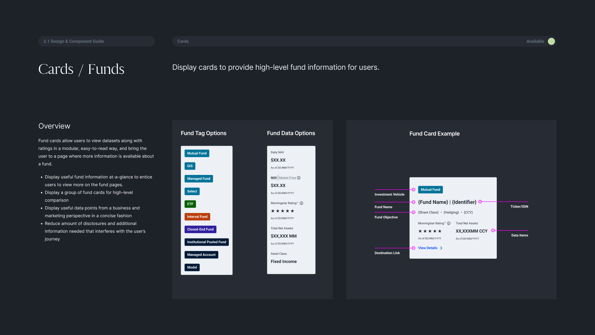
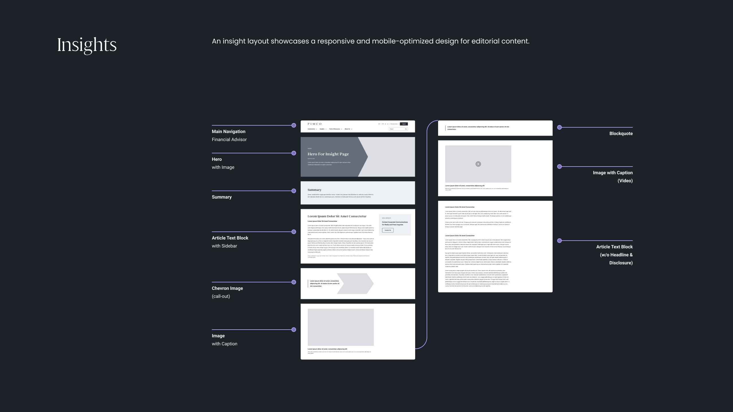
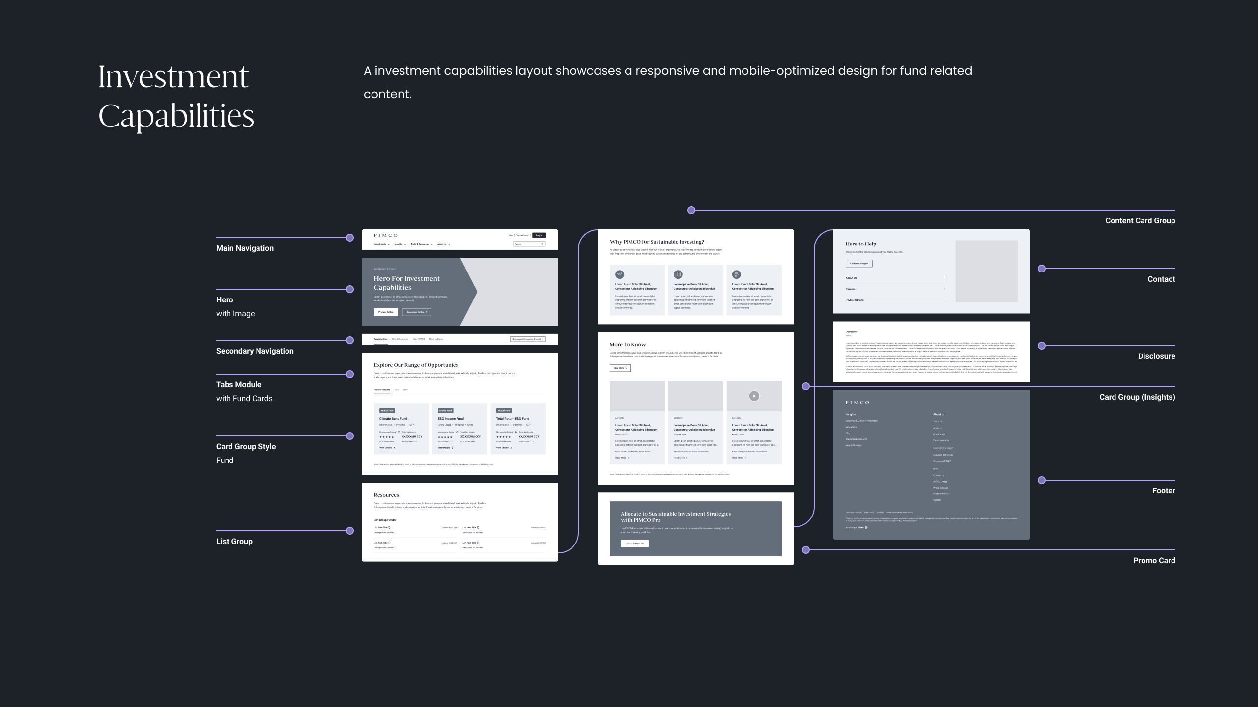
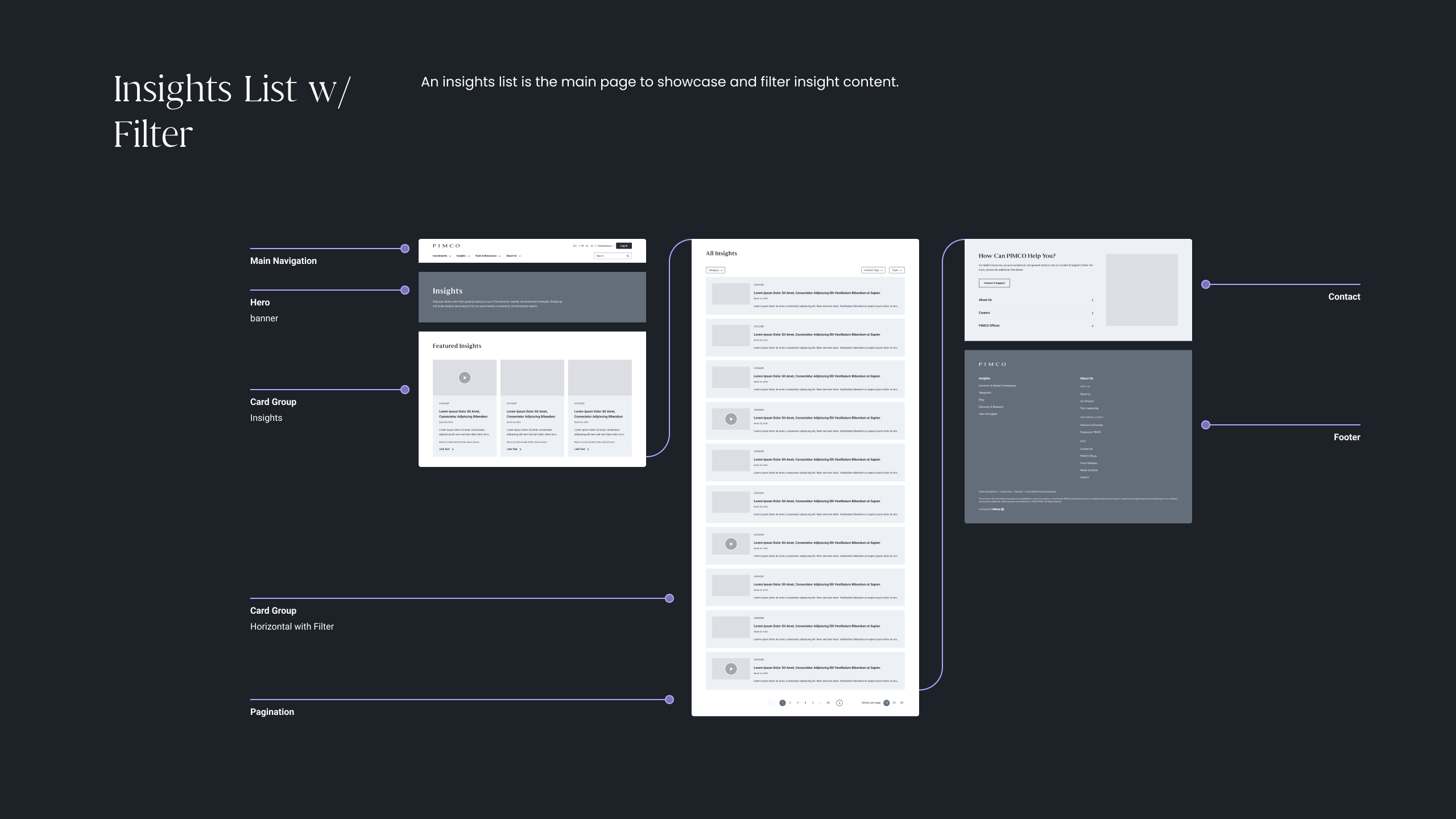
Design & Prototyping
The design phase focused on creating a straightforward information architecture and clear data visualizations, using progressive disclosure techniques to respect compliance requirements without overwhelming users.
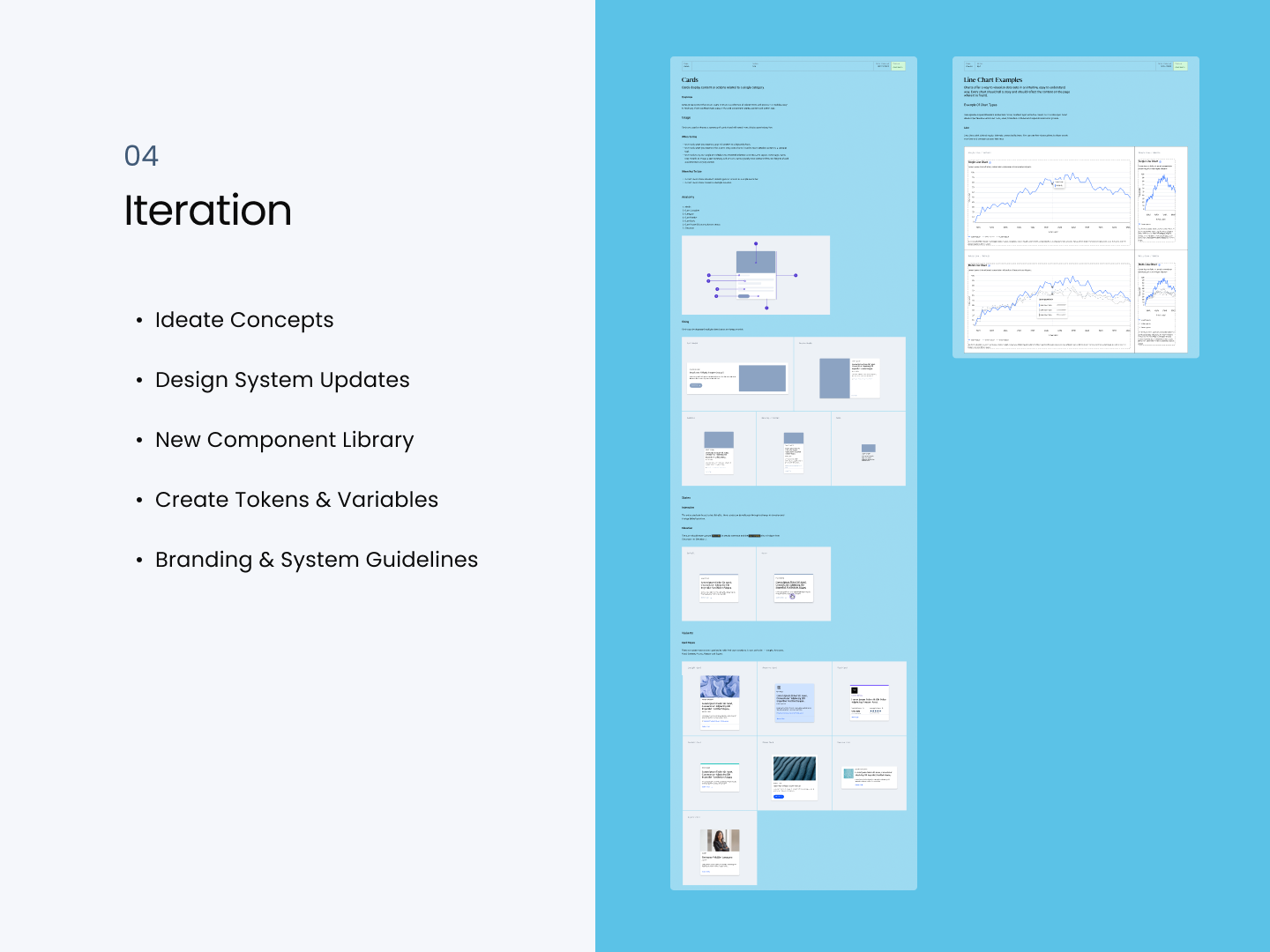
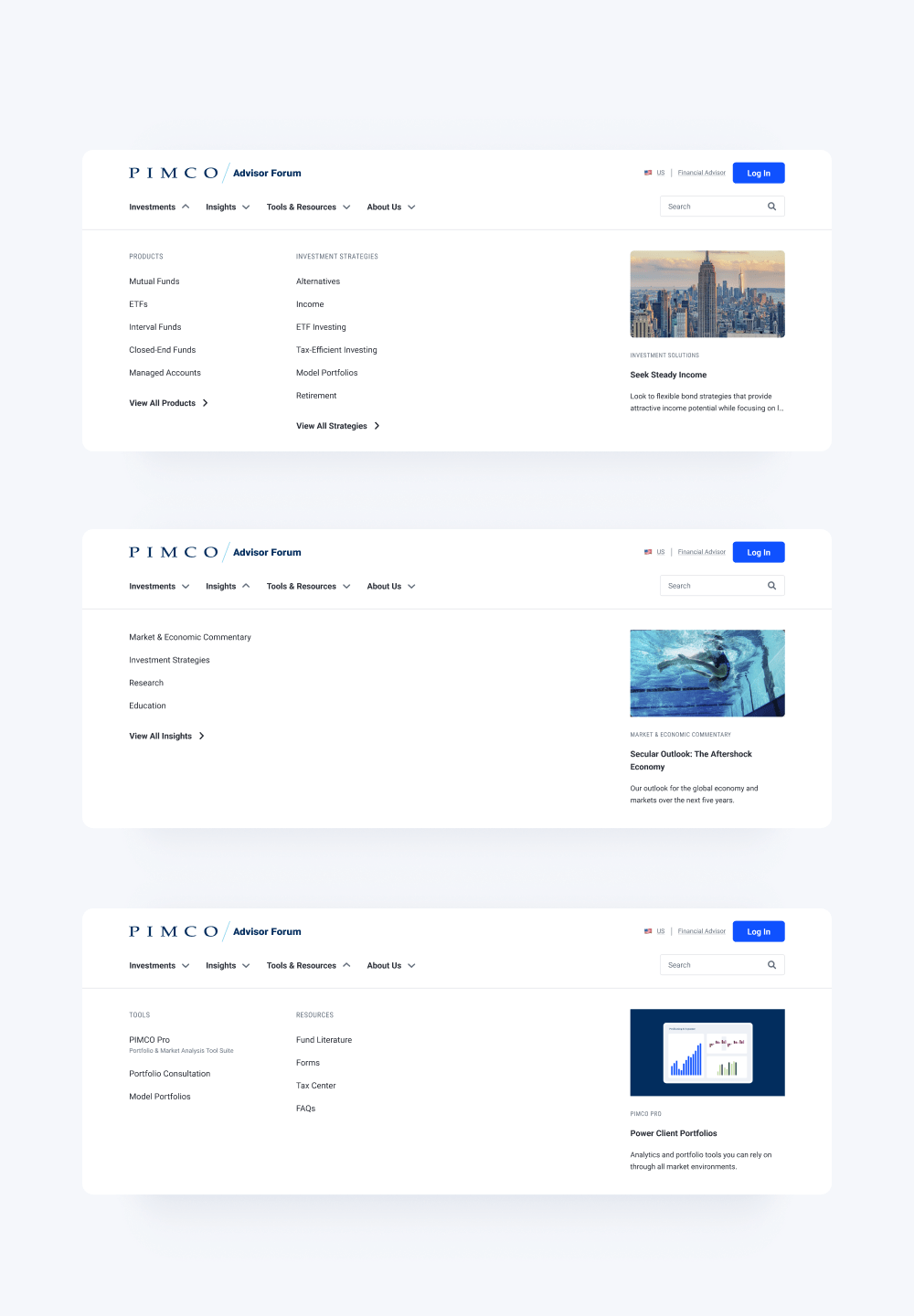
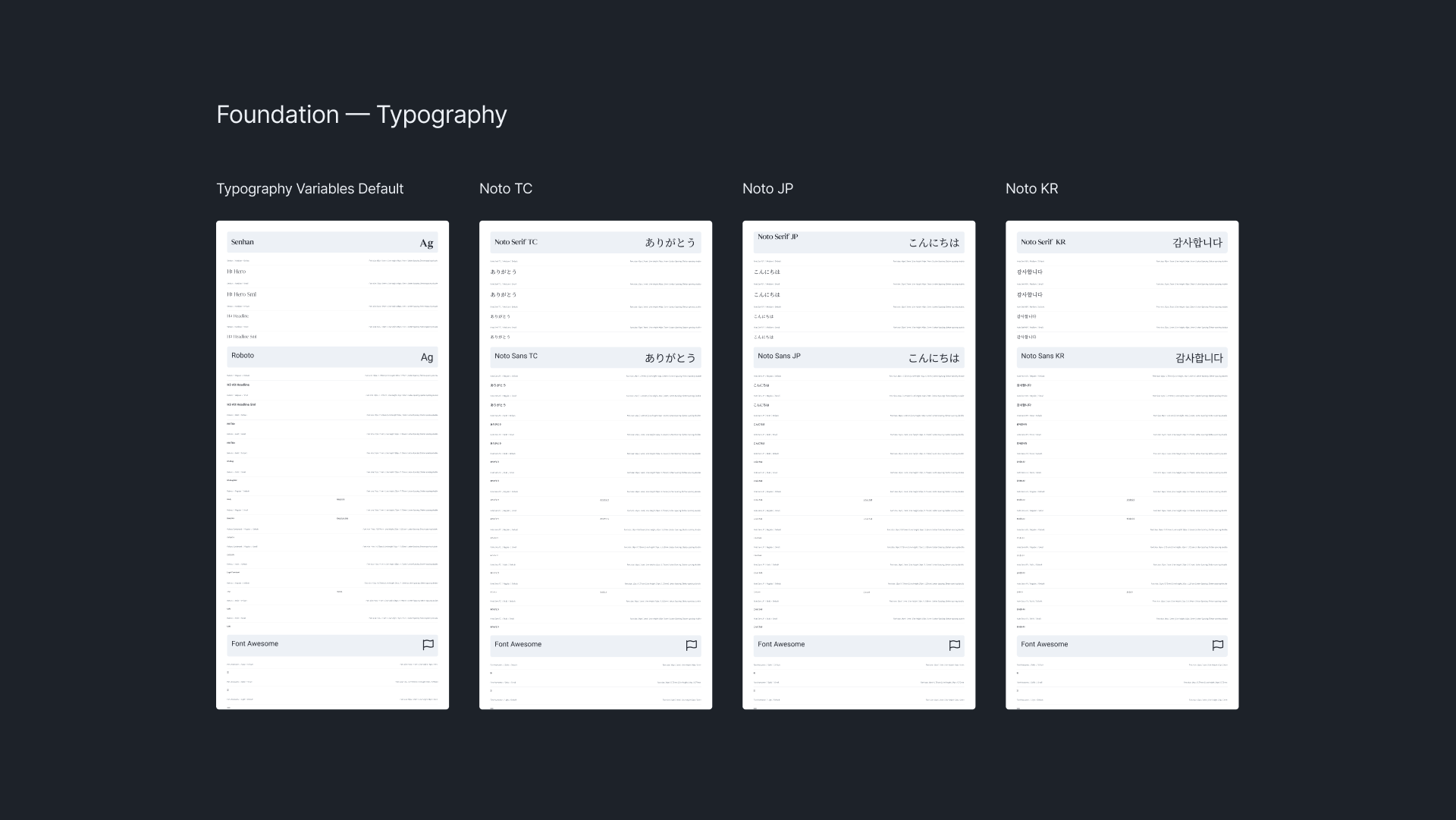
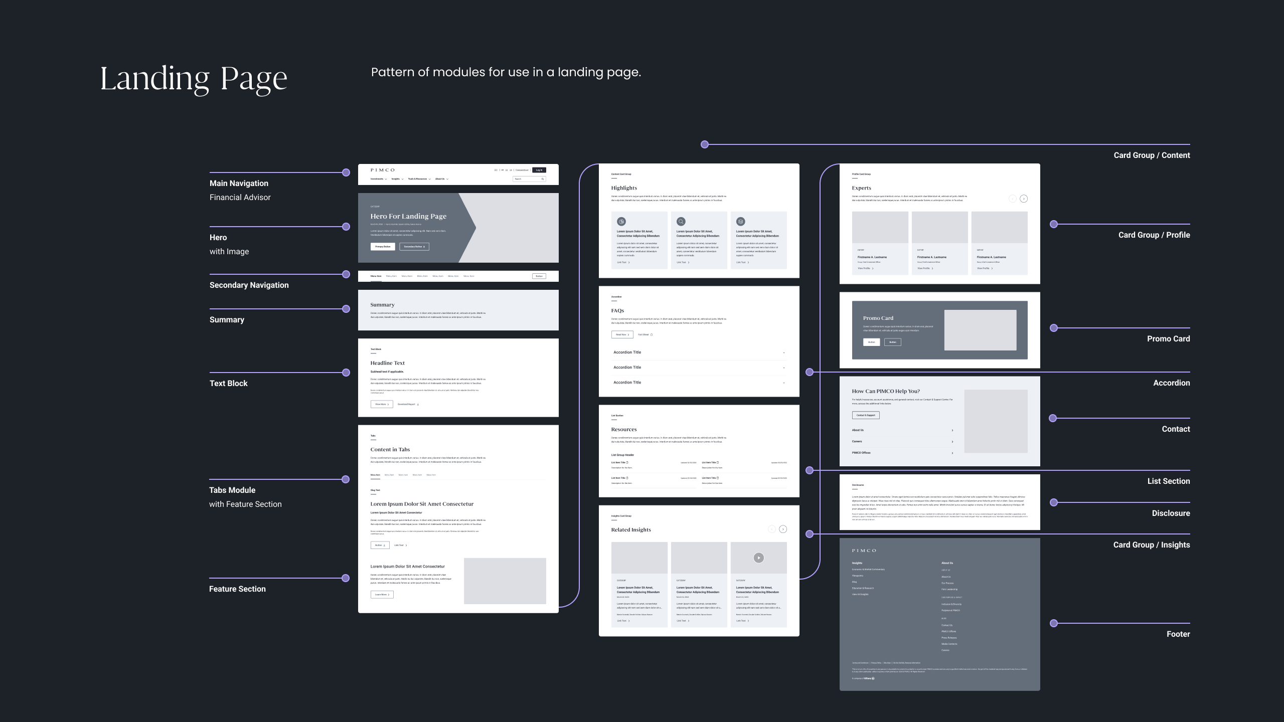
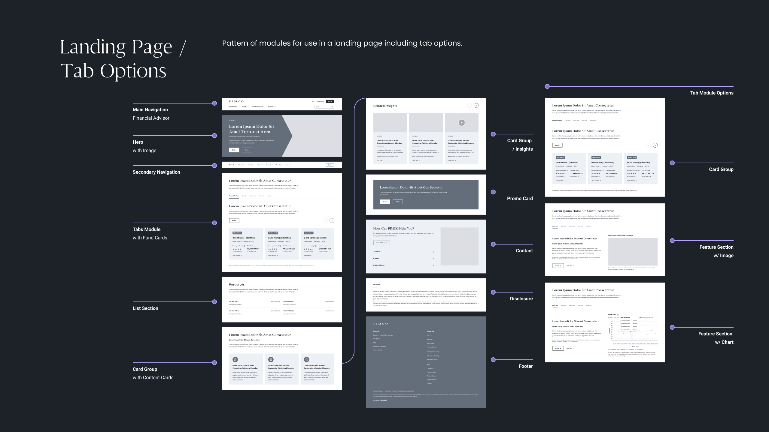
In the initial phase of transitioning from the legacy model “Classic” to the 2.0 design system under development, a Design & Component Guide was meticulously crafted. This comprehensive guide was presented to Marketing to provide an in-depth overview of the new design system. By summarizing the capabilities, benefits, and limitations of the module stages and introducing templates for consistency, the guide served as a valuable handbook and guidance throughout the design and development process, facilitating the successful launch of the MVP.
Refinement
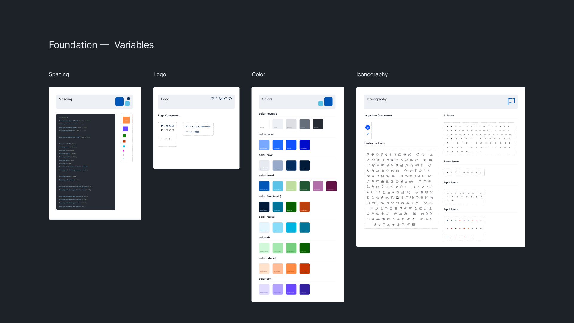
We refined components with modular layouts and optimized content hierarchy based on stakeholder feedback and usability testing. Working with Engineering, we set up Figma variables and Storybook tokens to improve timing on feature rollouts on the roadmap.
This also included regional variables in typography for testing different languages on a global scale. I always look at the bigger scale and the role selector prototype experience, as this is the first impression the user sees.
Information Hierarchy
Self-Selected Roles/Experience Comparison
Before Launch (2023)
After Launch (2024 w/ Advisor Forum)
Innovation in Accessibility
With a media and data-heavy product, accessibility was important to us, so I prototyped and tested a new media player with built-in transcripts. Working with the Dev team, we were able to launch a media player with transcripts available for screen readers and overall improve our accessibility score.
Reflection & Vision
This project demonstrates how thoughtful design system leadership can transform legacy platforms while enabling organizations to scale globally. Early prototyping proved crucial to aligning compliance and user experience teams quickly. Balancing regulation with usability is an ongoing challenge and area for growth in financial product design.
A balance between simplicity and detailed financial information is important for financial sites that serve advisors and institutional customers. We enhanced cross-team efficiency by 40%, cut inconsistencies, and sped up feature delivery. Next steps are 4.0, which includes some iterations shown above.