How Scholly Became Featured in the Apple App Store
Search, Payoff, and Application Management
*Aquired by Sallie Mae
Timeframe
2020 - 2021
Role
Head of Product Design
Overview
Scholly started off on Shark Tank and after a couple of years aimed to expand its user base and improve engagement by redesigning its iOS app to make scholarship searching faster, easier, and more personalized for students. The challenge was to balance simplicity with complex functionality while maintaining the app’s usability and inclusivity.
The Search app lacked the ability to apply for scholarships within the app sending students to links to other sites. This posed a problem as a paid app and users found it lacking value. The list of scholarships brought students to an external website to apply. Without a clear walkthrough of the app, students were confused about how to use features and we were unable to control outside data and applications. We set out to change that.
Role
As the Head of Product Design for Scholly, I oversaw the entire end-to-end design process, which included research, facilitating discovery workshops with leadership, validating designs, and testing prototypes. I collaborated closely with stakeholders, marketing, product, and the engineering team to ensure that the Search App and new Application Management Tool launched in alignment.
Furthermore, I held design workshops, conducted user journey mapping, created content strategy including architecture, competitive analysis, and data analysis.
Leading my team to work in agile sprints to ensure smooth development within the roadmap. I also initiated the creation of a design system in Figma to be integrated with Storybook for consistency.
Challenges
- Need to increase user engagement
- Long onboarding form
- Applications led to outside of app
- lack of scalability
- Need to keep users on the paid platform instead of linking out to outside sites
- Increasing uninstalls and decreasing active daily users
Process
- We identified key UX metrics and iterated on improvements
- Used quantitative and qualitative data from universities and students to make informed design decisions
- Implemented heatmaps, A/B testing, and survey feedback to refine the application flow
- I held design workshops with my team, stakeholders, product, and engineering.
- We created interactive prototypes and worked in agile sprints to ensure smooth development
- Switched from Sketch to Figma for better collaboration and design system management
Impact
The app was redesigned with a focus on student’s time and needs. We also simplified the application process and revised the core value proposition to increase the overall conversion. Added was a feature to allow a student to apply in a short amount of time-based on the onboarding questions defined by the donors.
This lead to the iOS app being featured in the Apple App Store and becoming App of the Week on multiple occations in 2020 and 2021.
Implemented Solutions
- Intuitive quick onboarding
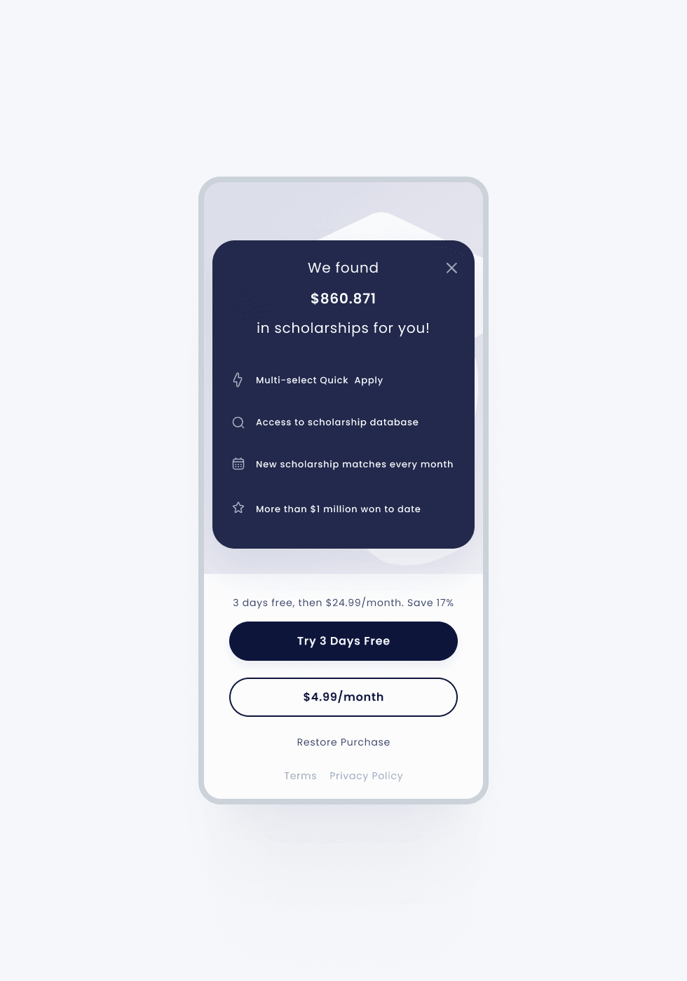
- Accessible and user friendly paywall
- A common app profile to create a sort of LinkedIn for college students
- Apply for financial aid and grants within the app
- Savings account to help reach financial goal
- Quick apply feature for scholarships based on profile information
- Application management for donors
- Atomic design system
- Light and dark themes
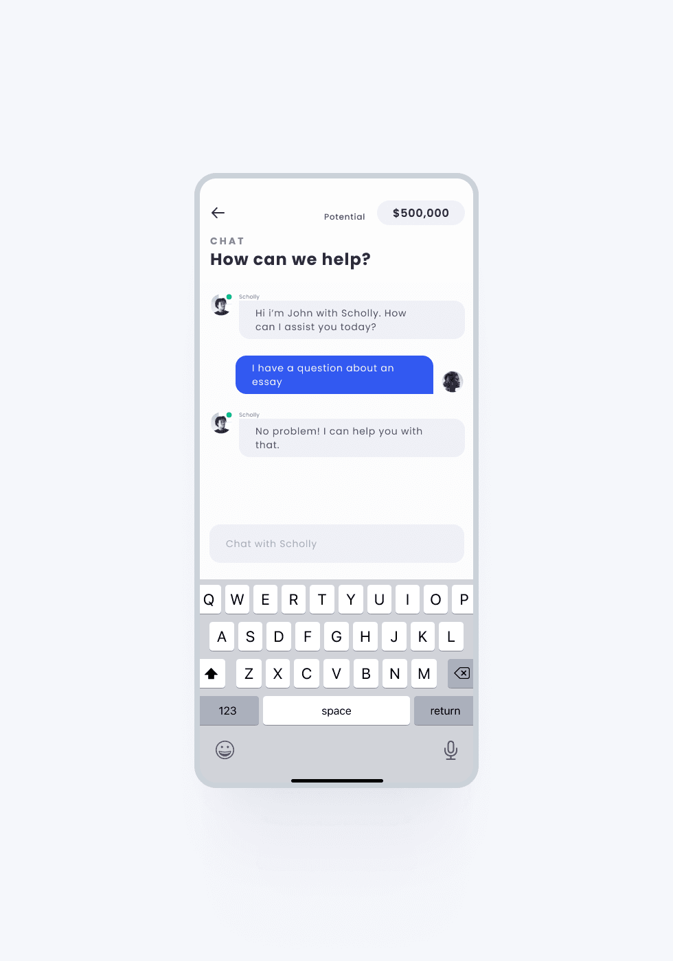
- AI Chat Bot to help students and parents
- University information and applications
Outcomes
- 4.5/5 rating in the Apple App Store
- Featured By Apple
- 0→1 launch of Application Creation Management Tool
- 25% improvement in application completion rates and increased user retention
- Increased user retention
- *Has been acquired by and is a part of Sallie Mae
Results
0.00
In new scholarships secured
0.00
New app downloads
0.00
Increase in new account sign-ups
0.00
Increase in user engagement
iOS Search App
Research findings for both students and donors have been used to iterate the wireframes during the design process, improve user experience on the website, and create the ultimate design solution. Being able to streamline exclusive scholarships for the donor gives us the parameters to allow students to quickly review and apply to applications.
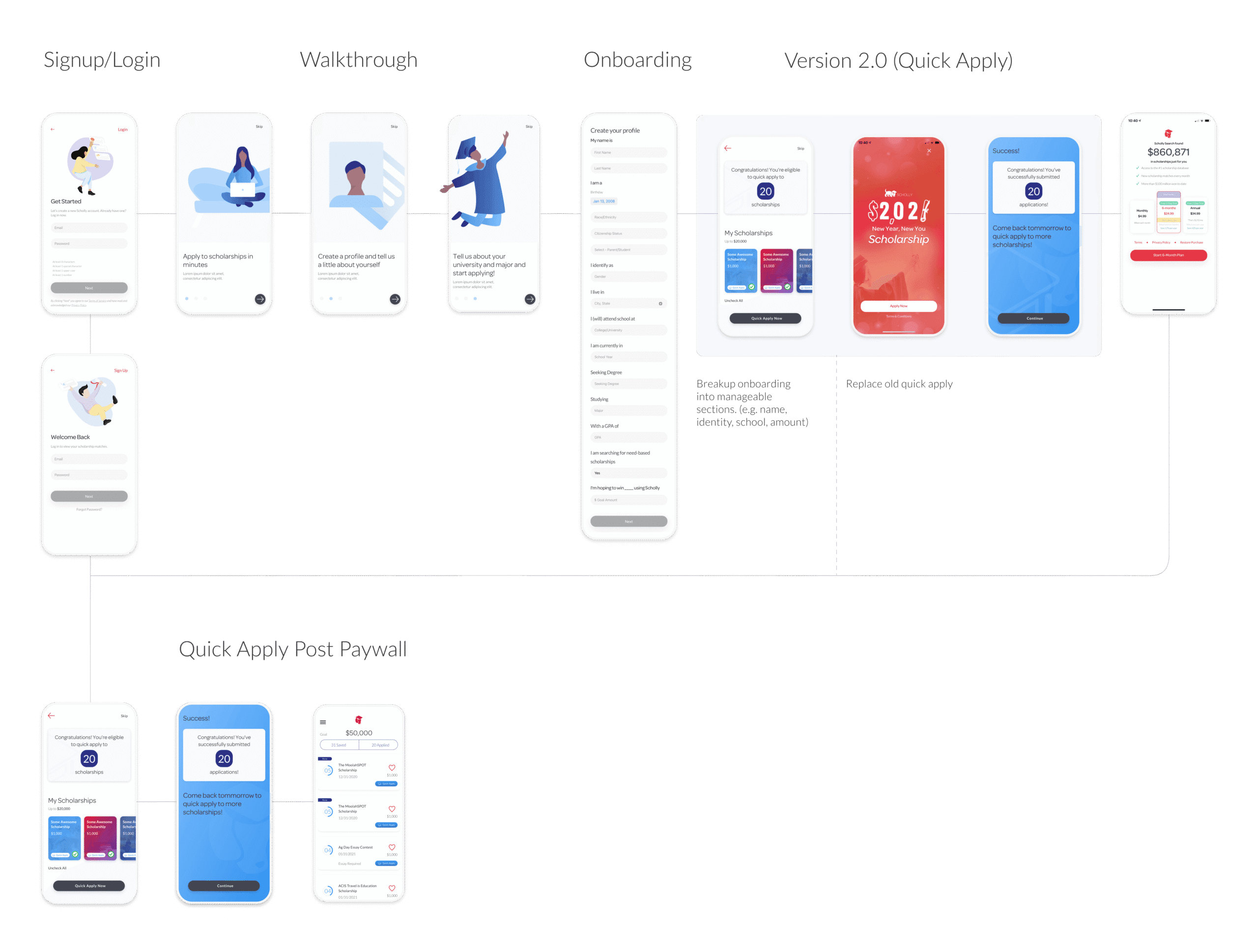
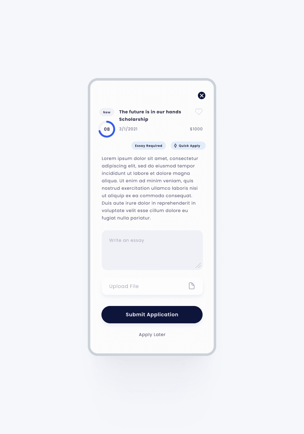
The Before: Initial Search Journey Flow & Screenshots
This my initial user journey notes and screenshots when first I came onboard. First phase of the Search product was to replace the old “Quick Apply” (red screen) feature which only offered one seasonal application to multiple applications. Also, needed to update the paywall to be more accessible and user friendly.*Just the multiple quick apply and success screens are my designs to try and fit in with the existing old theme

Search & Profile
Experience
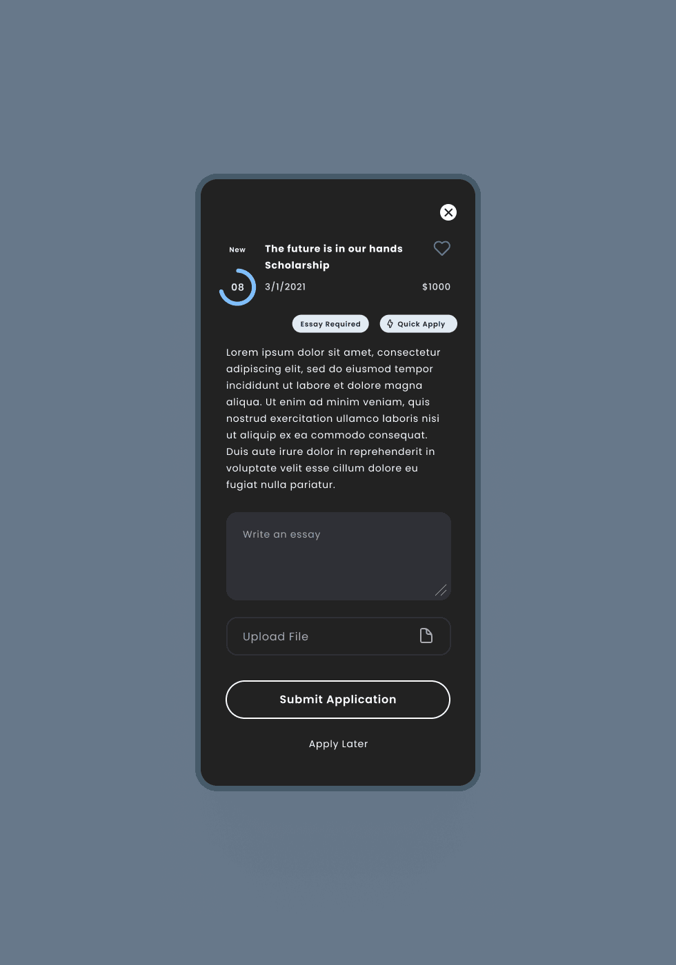
The After: New Improved Search App
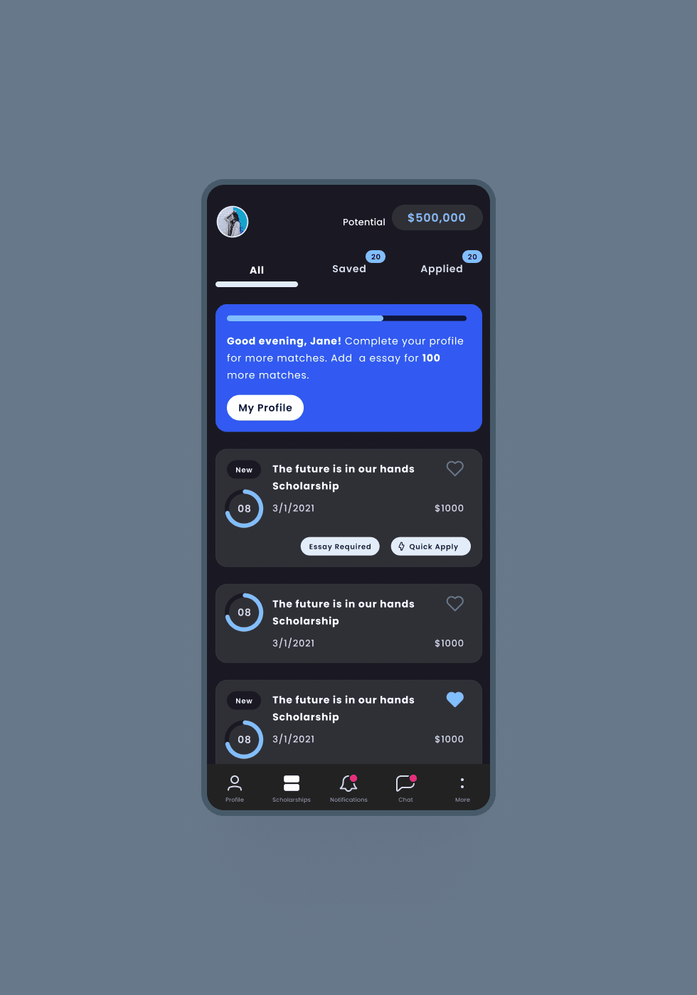
The next phase was to rethink the user journey using data-driven insights and add gamification with a common app profile. The more a user completes their profile, they are granted access to more features and applications. We noticed that there was more traffic in the evening which makes sense because students tend to be in class or work during the day. So we created both a light and dark theme for late night users. This all added more value to the Search app.
We noticed that there was more traffic in the evening which makes sense because students tend to be in class or work during the day. So we created both a light and dark theme for late night users.
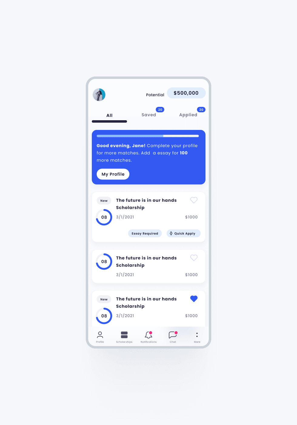
We set out on a journey for the new iOS Search app to be the only app a college student would ever need. LinkedIn for college as we called it.
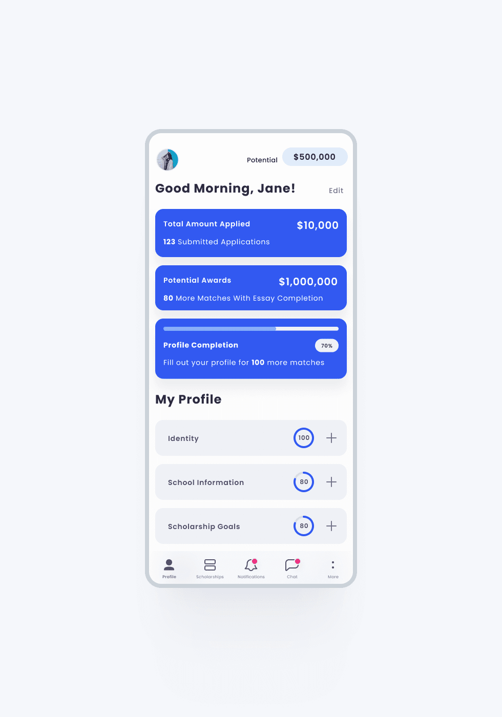
Common App Profile
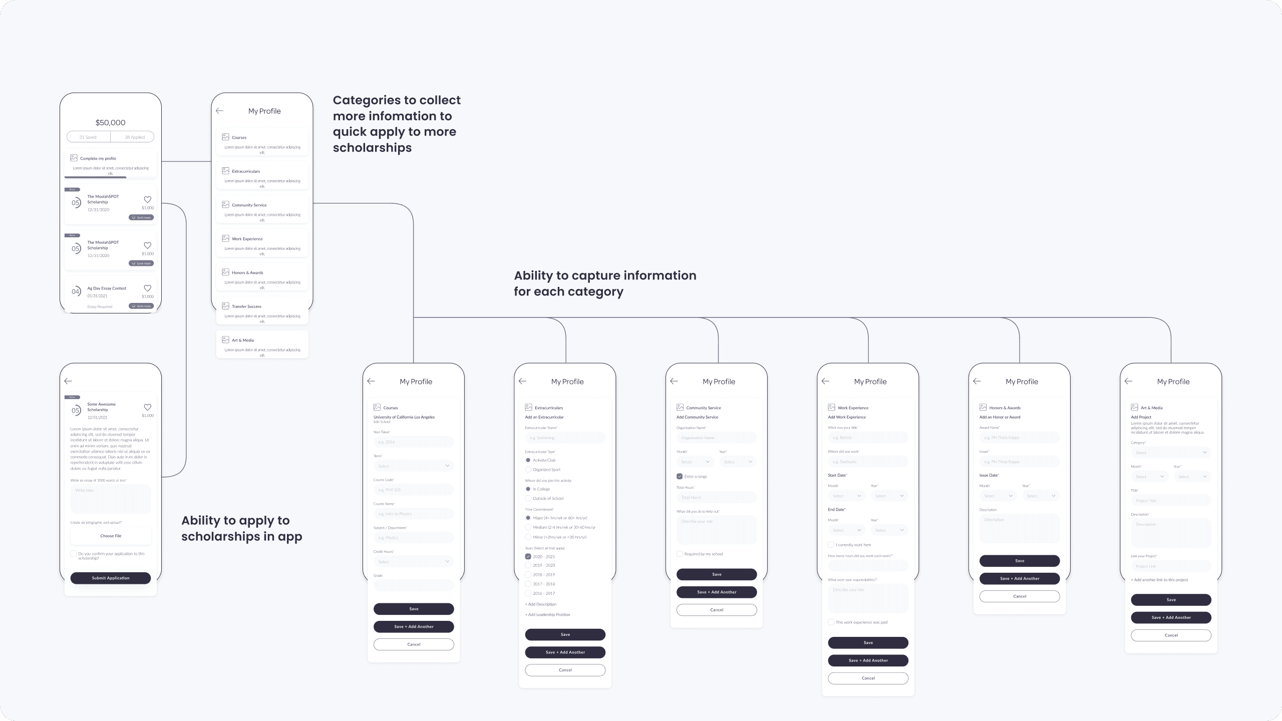
More features were on the roadmap to be added including PayOff. PayOff was a new product to connect students with financial aid that scholarships didn’t meet the full goal set out or to refinance loans. We also connected university information, admissions applications, and the FASFA form within the app. An AI Chat Bot was added to help students and parents with questions. We set out on a journey for the new iOS Search app to be the only app a college student would ever need. LinkedIn for college as we called it.
Architecture
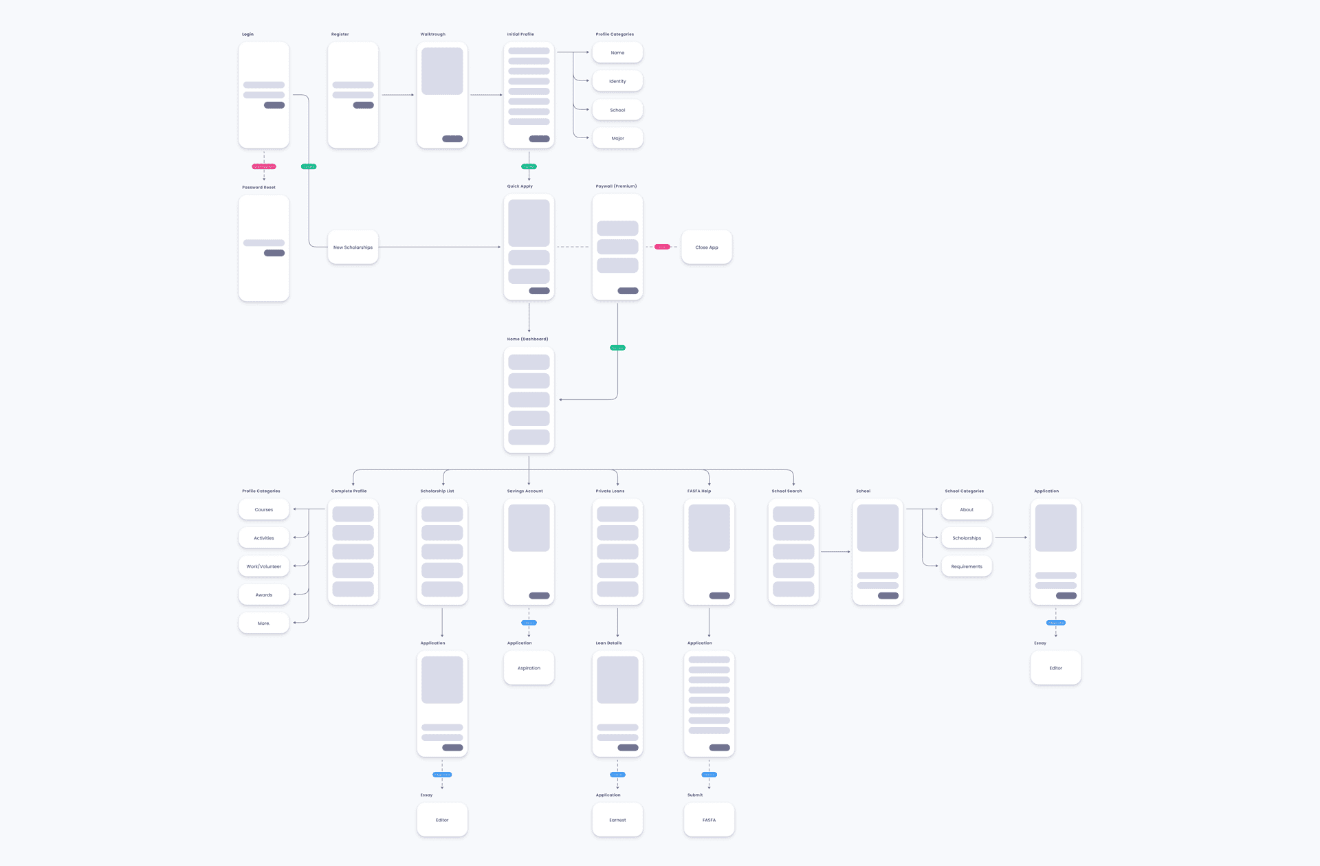
An atomic design system was created with custom components for scalability across products. This helped the continuity of work between the product design team and engineering and sped up production launches.
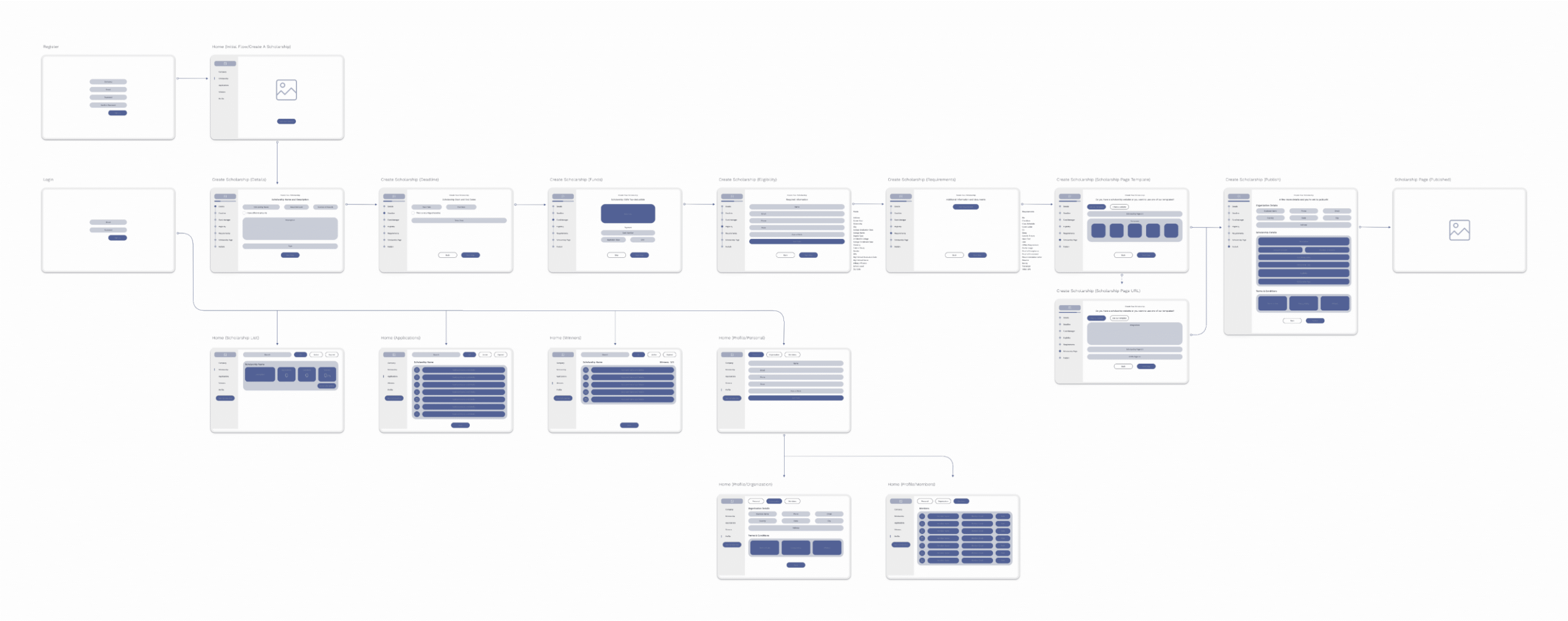
Scholarship Creation & Management Application Hub
Creating exclusive scholarships for organizations and donors was key to utilizing the common app feature for students. A scholarship provider can set up an application based on common parameters that are predefined, making it quicker for students to apply to applications based on their profile completion. A donor can also manage applicants to choose top picks for the award and application stats all in one place.
Summary
Based on the interviews with participants and researchers, we have devised a pattern to keep users coming back by easing the amount of time going through applications. It symbolizes the young people use this app if it fits into their lifestyle and schedule. With applications built into the app, any student can quickly apply for a scholarship on their breaks. Providers can also set up exclusive applications and manage applicants all on the same platform.